Empowering a New Generation of Global Innovators
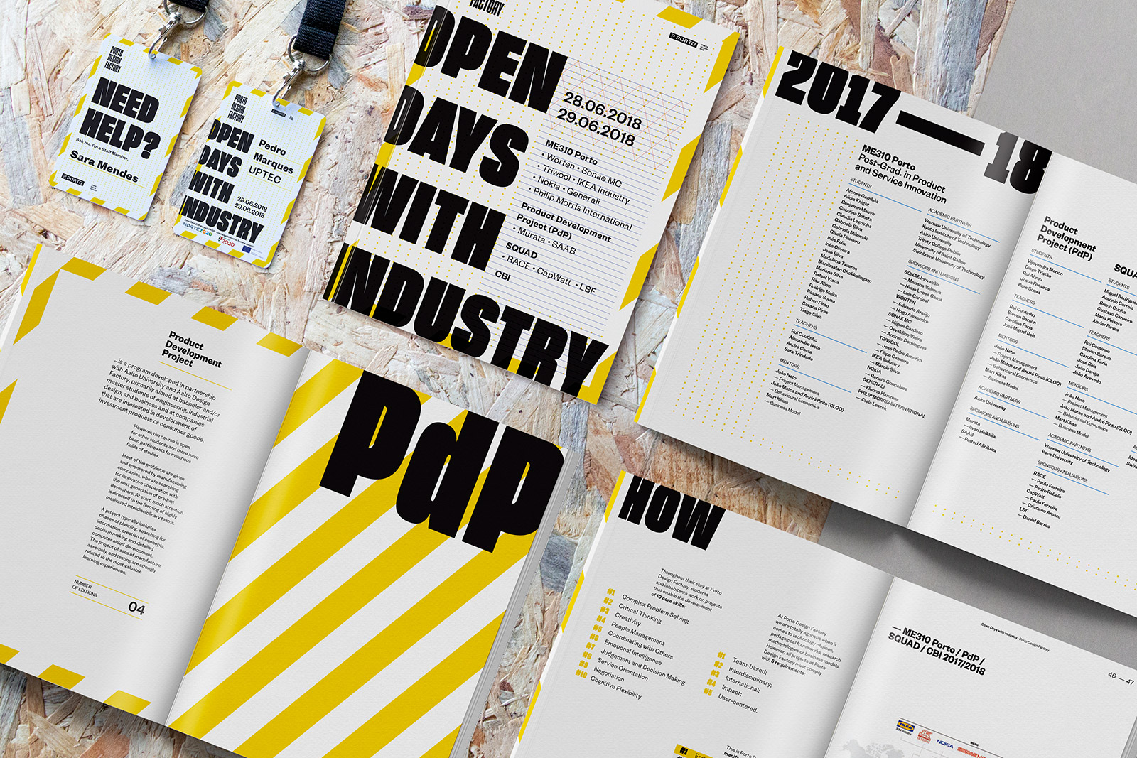
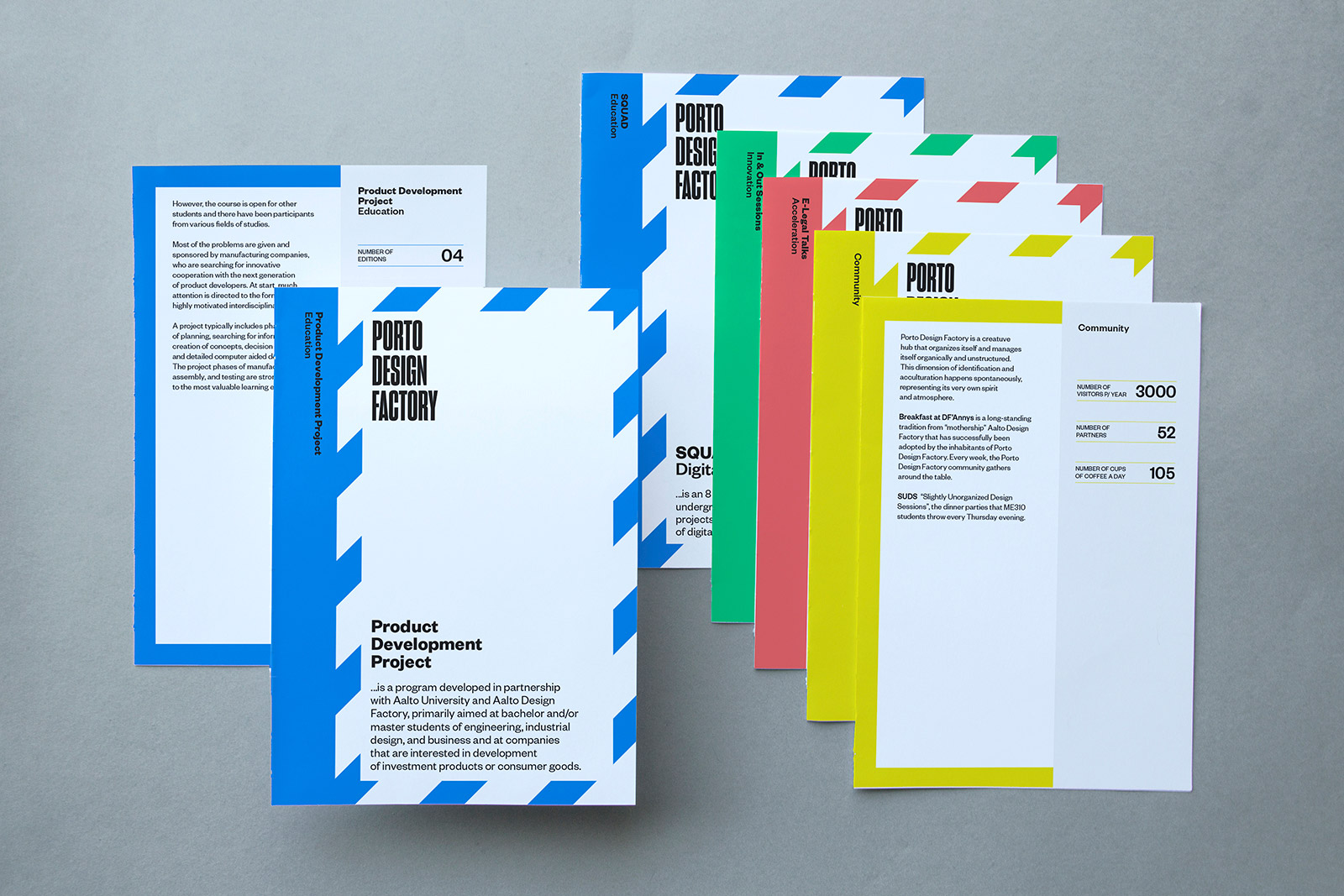
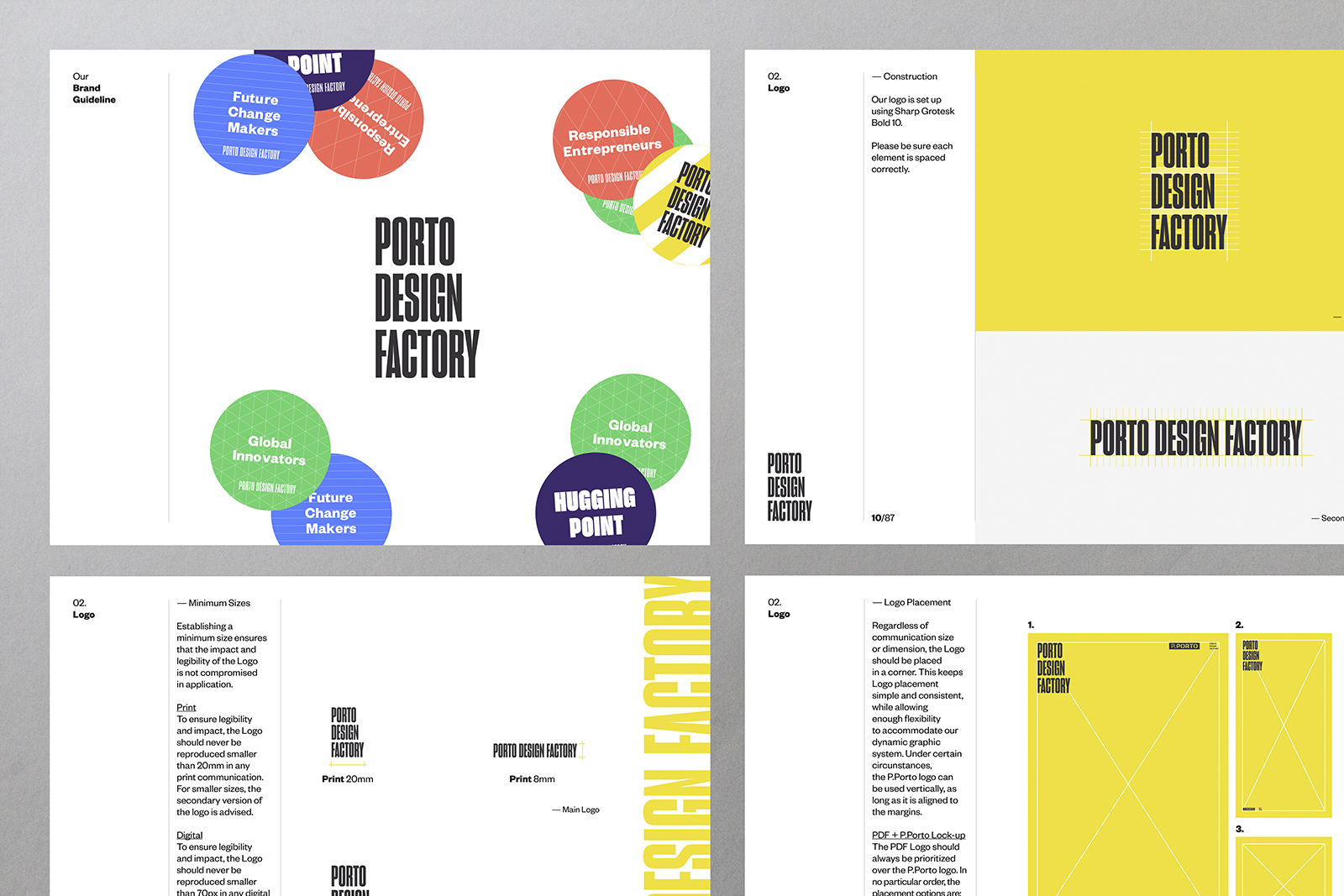
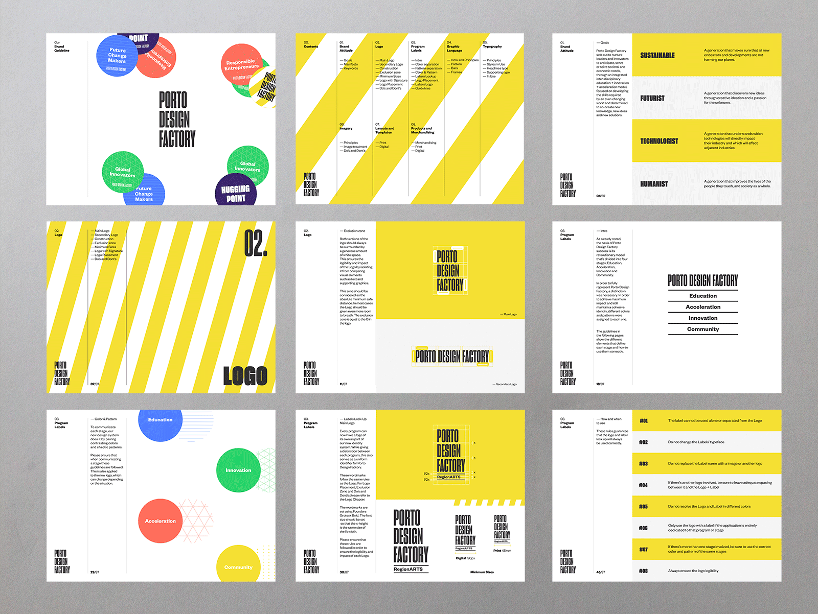
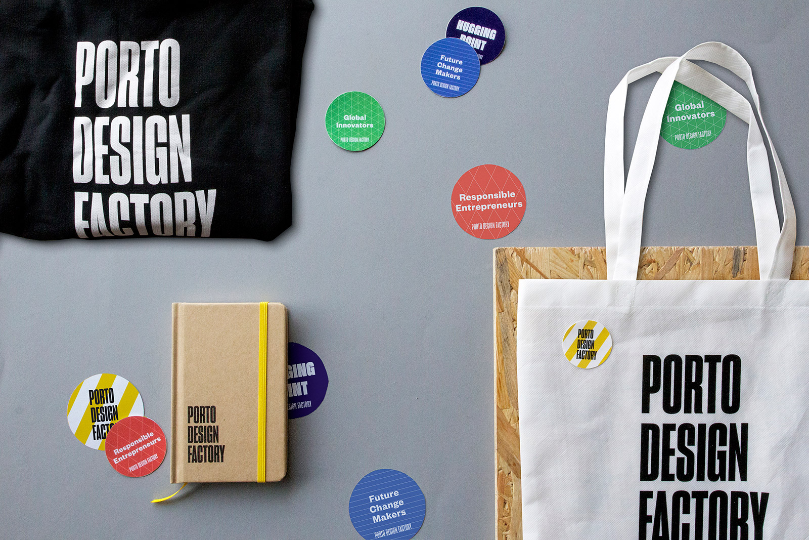
Porto Design Factory is an experimental learning platform of co-creation for interdisciplinary education, innovation and acceleration of new ideas, products and business. It is also the catalyst for an experimental educational culture based on "passion-based learning", aiming to promote better results in learning, enhance employability and improve the interface with companies. While Porto Design Factory communications are made up of several elements, the Logo is still the focal point. Displayed on every piece of communication, the new PDF identity system now allows for every program to have a logo of its own. While giving a distinction between each program, this also serves as a uniform identifier for Porto Design Factory.

Focus on Process
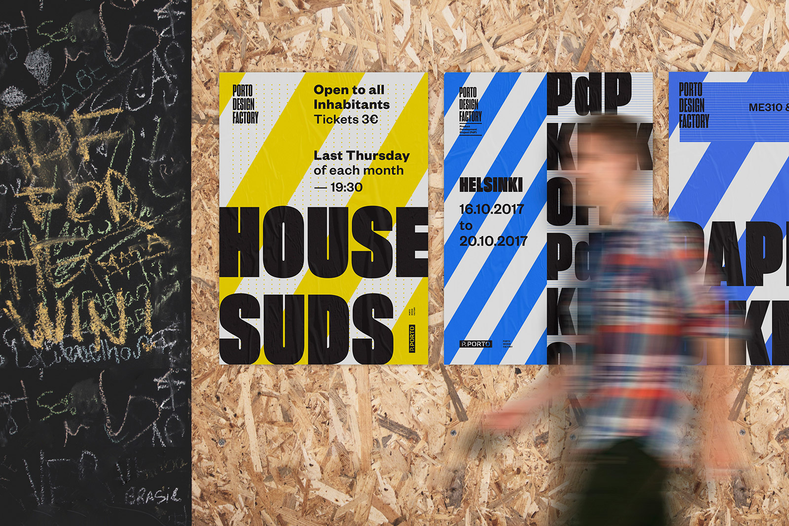
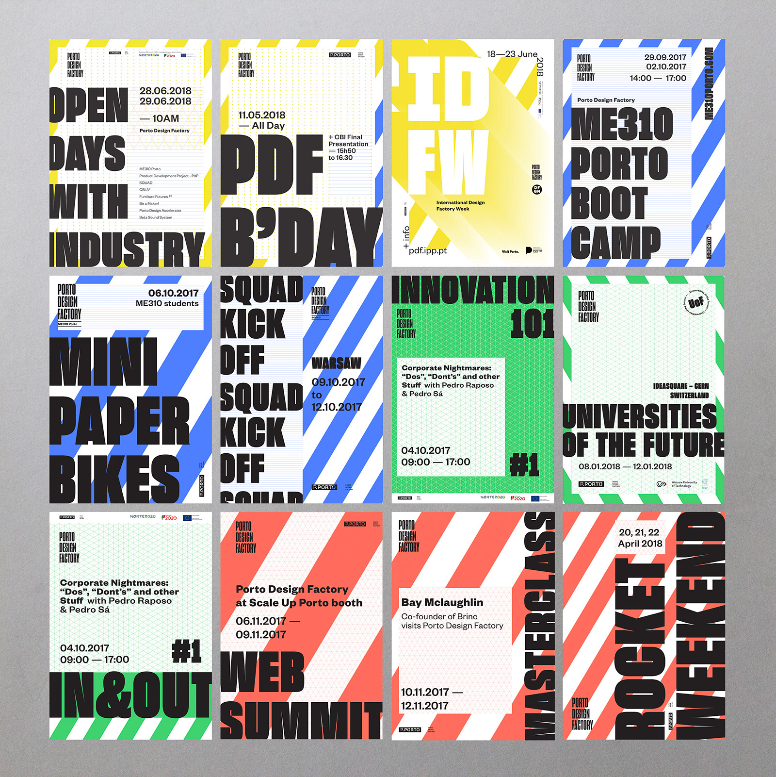
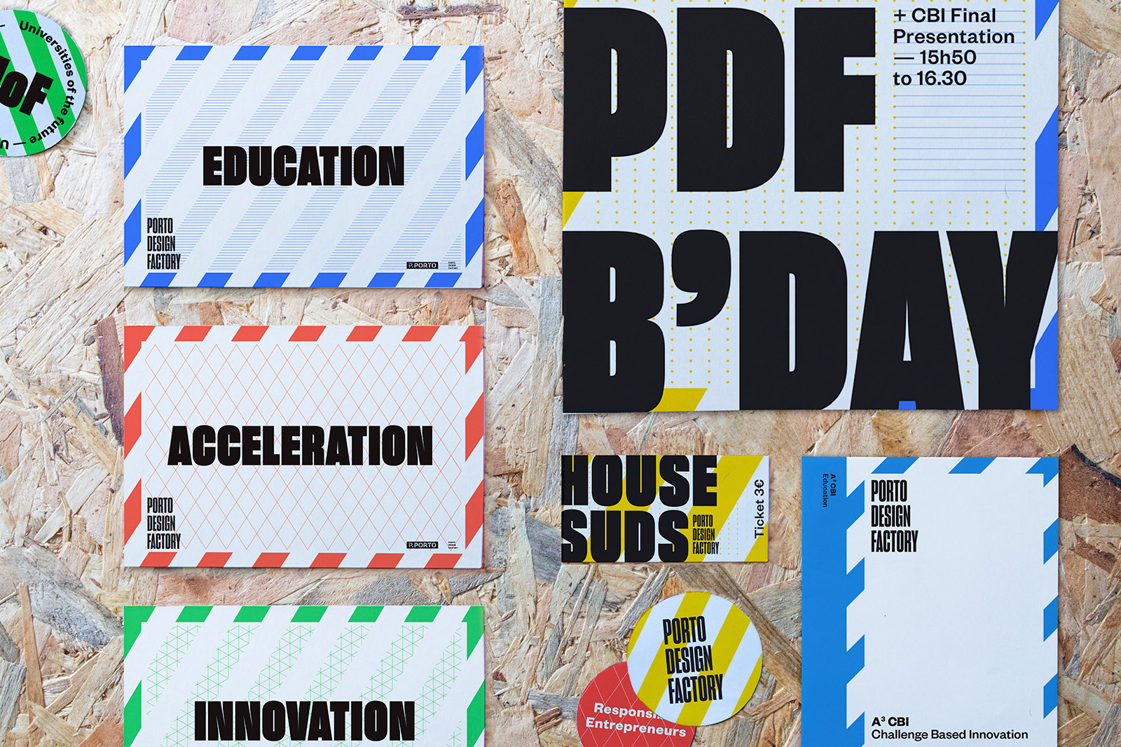
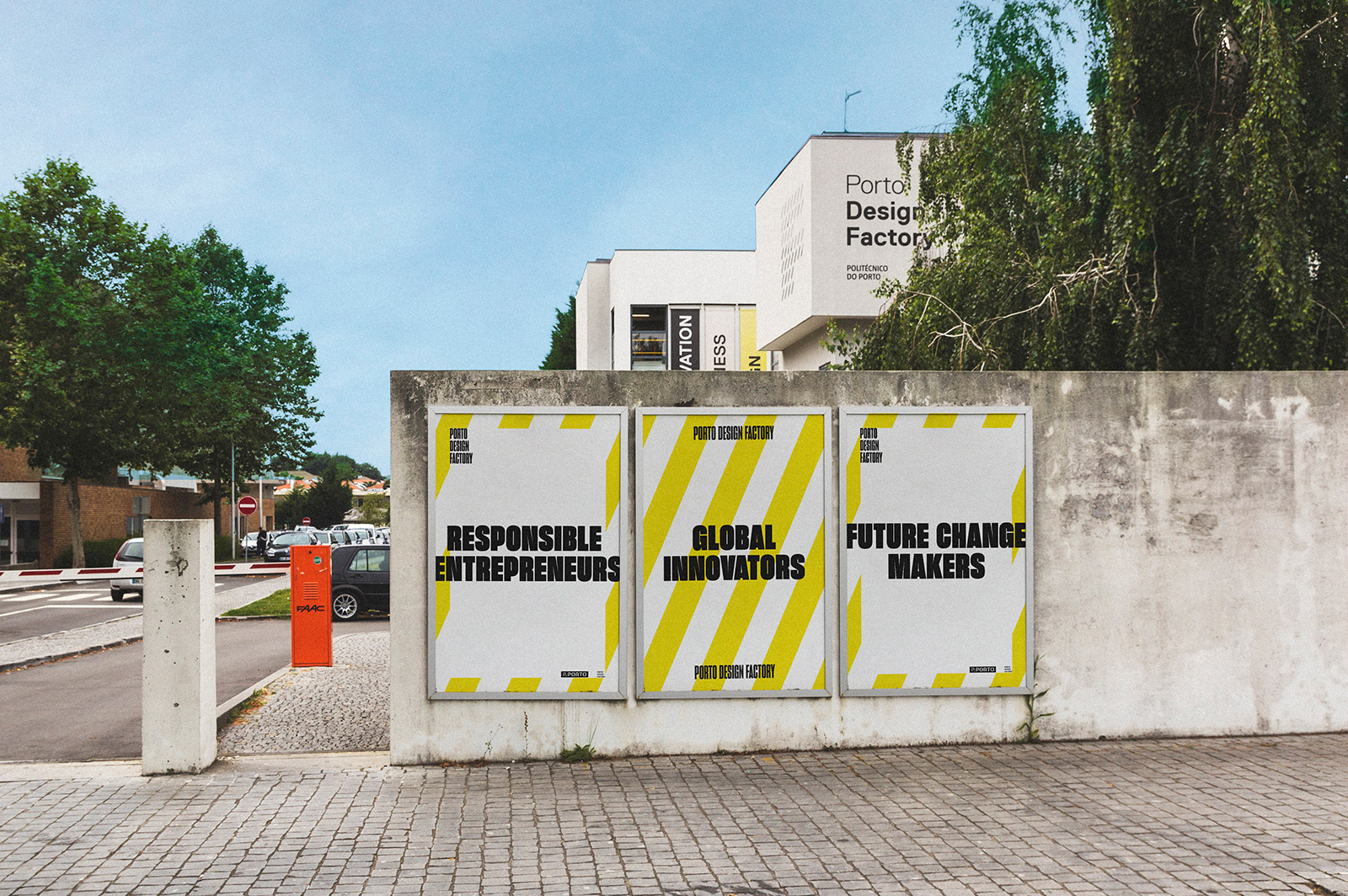
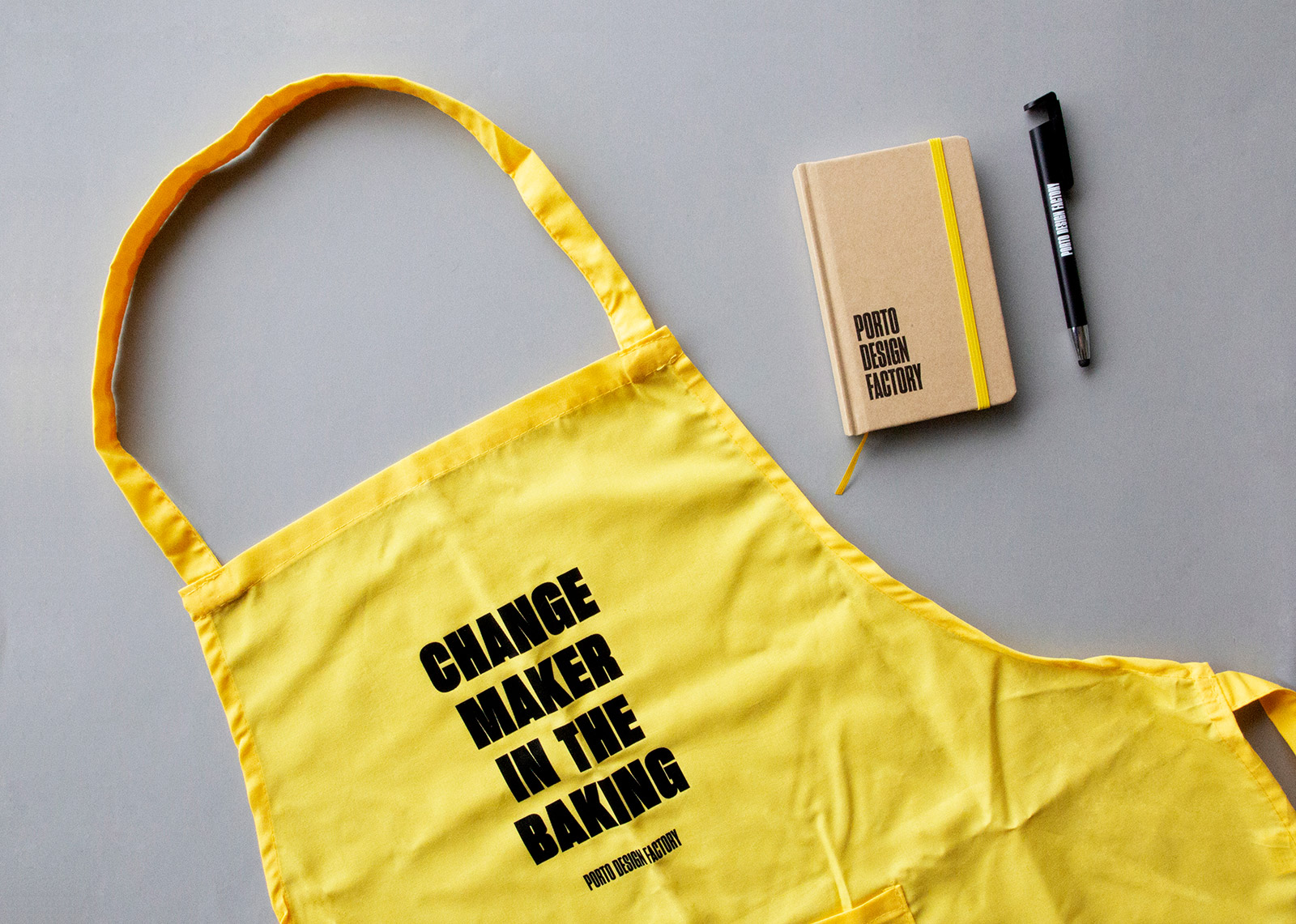
Our strategy for PDF’s communication was to focus on what distinguishes PDF from every other school — the process. Being a part of Porto Design Factory means you are unwilling to be quiet; always looking for ways to do better; means embracing chaos but with the purpose of creating an impact in the world — it’s all about the process that builds success. The strategy began by differentiating the PDF’s revolutionary model that’s divided into four stages — Education, Innovation, Acceleration and Community. To each of these models were assigned different colors and a pattern that resembles a sketch notebook. The purpose was to reinforce the process — the process of sketching, drawing and writing, as well as to reflect the challenges and support behind each student, project or program of PDF. While allowing each stage to have a life on its own, it also kept the Porto Design Factory identity simple yet flexible.
Taking Risks
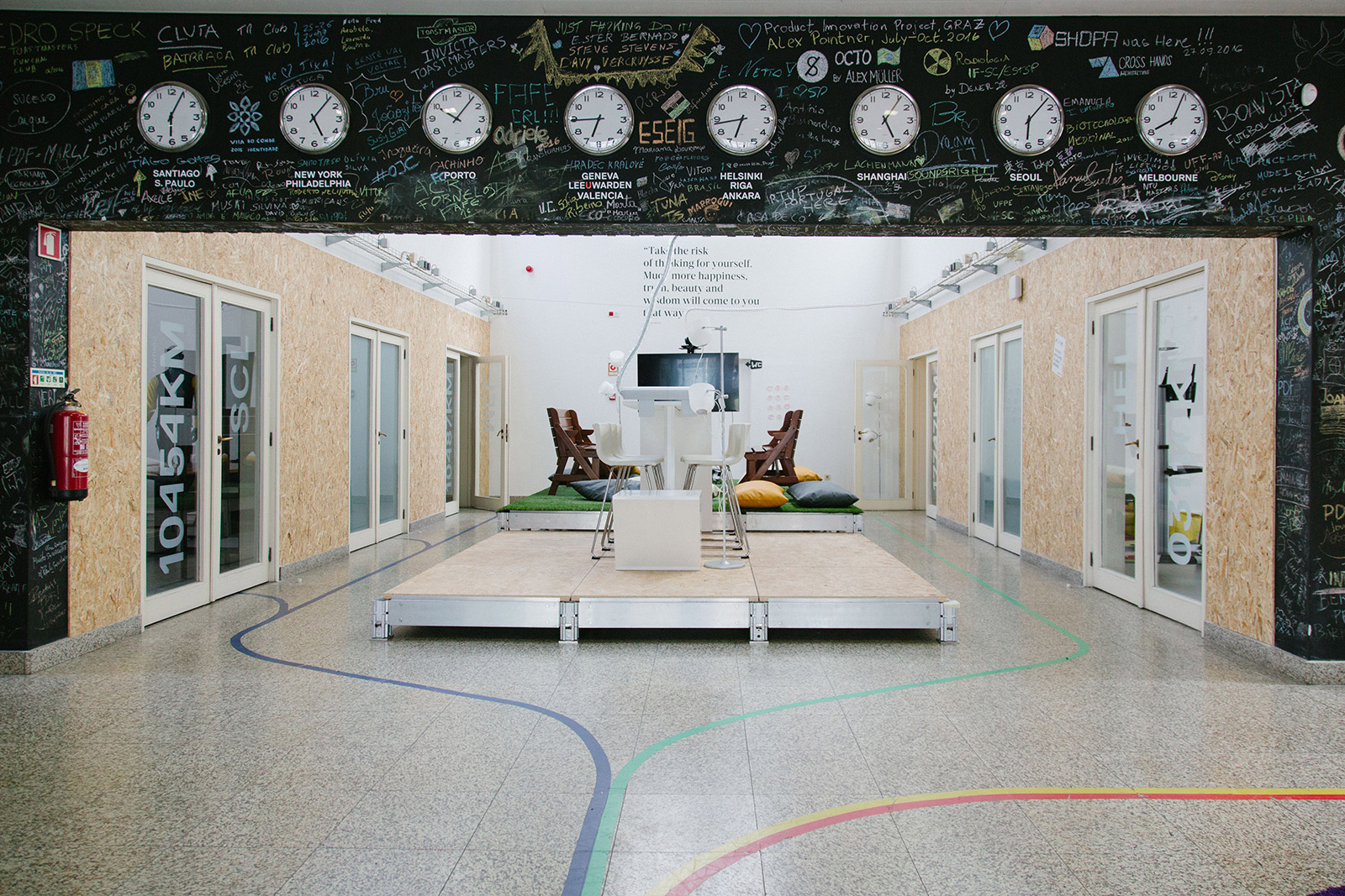
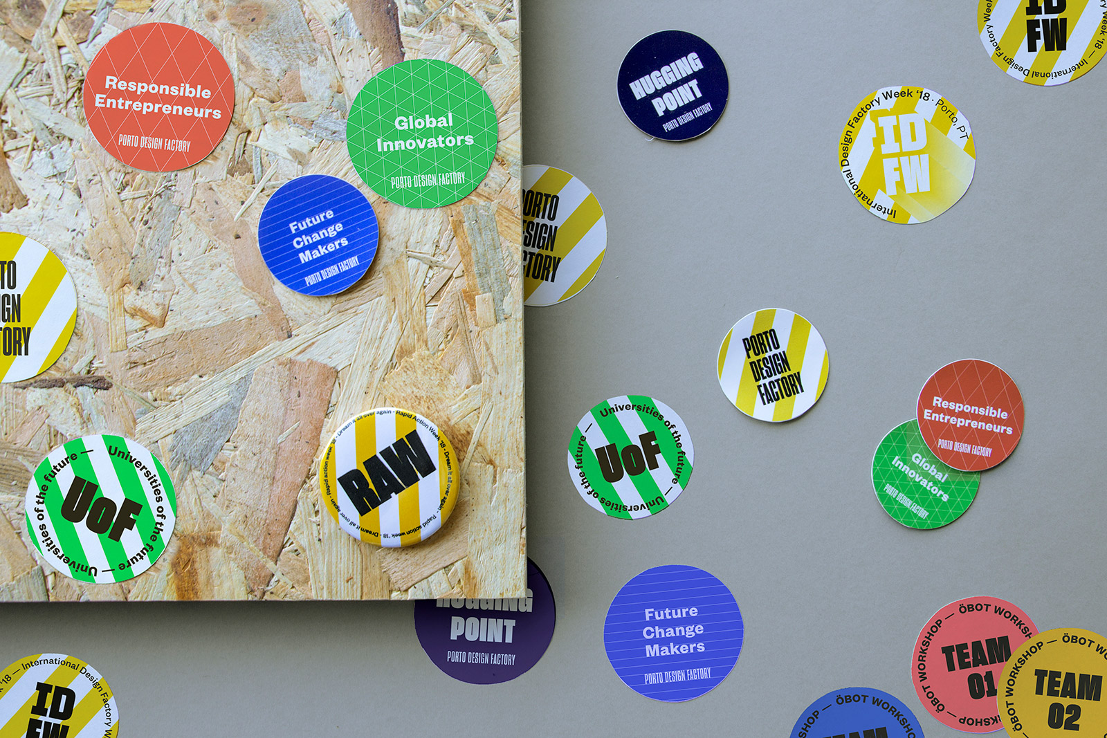
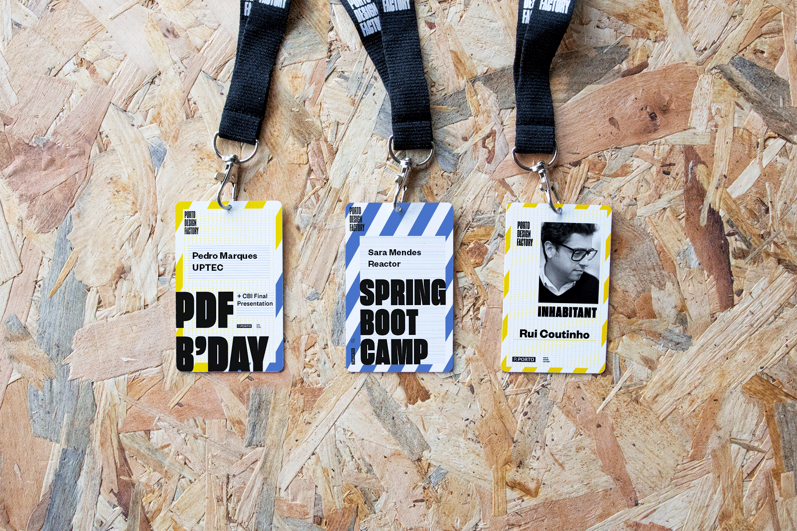
This new identity system enabled a better differentiation between stages, but there was still a need to communicate Porto Design Factory as a whole. Besides the Logo, 2 different elements were designed to fully communicate the chaos and taking risks that defines the PDF aesthetics. The first one was the overlap of every stage’s pattern, that aimed to show how each stage is closely intertwined and the chaotic result of that, while also representing the revolutionary teaching method. The second element, used to represent PDF as one, are the signalling tapes. Already scattered throughout the building, they symbolise work in progress and reinforce its importance. A set of comprehensive guidelines were designed to explain the new identity system, thus ensuring that the PDF’s dynamics don’t get lost along the way.