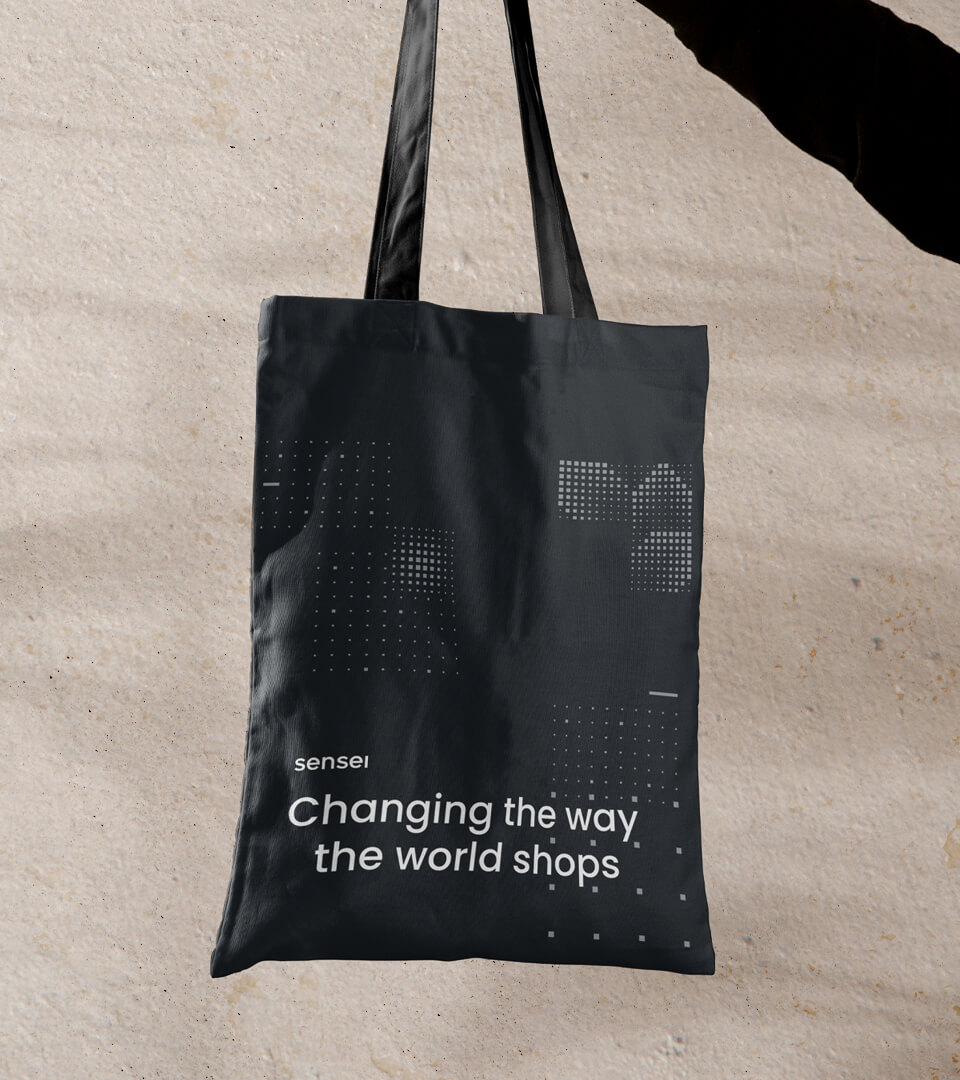
Changing the way the world shops.
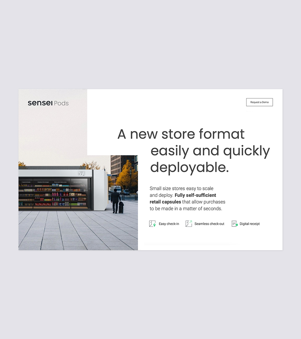
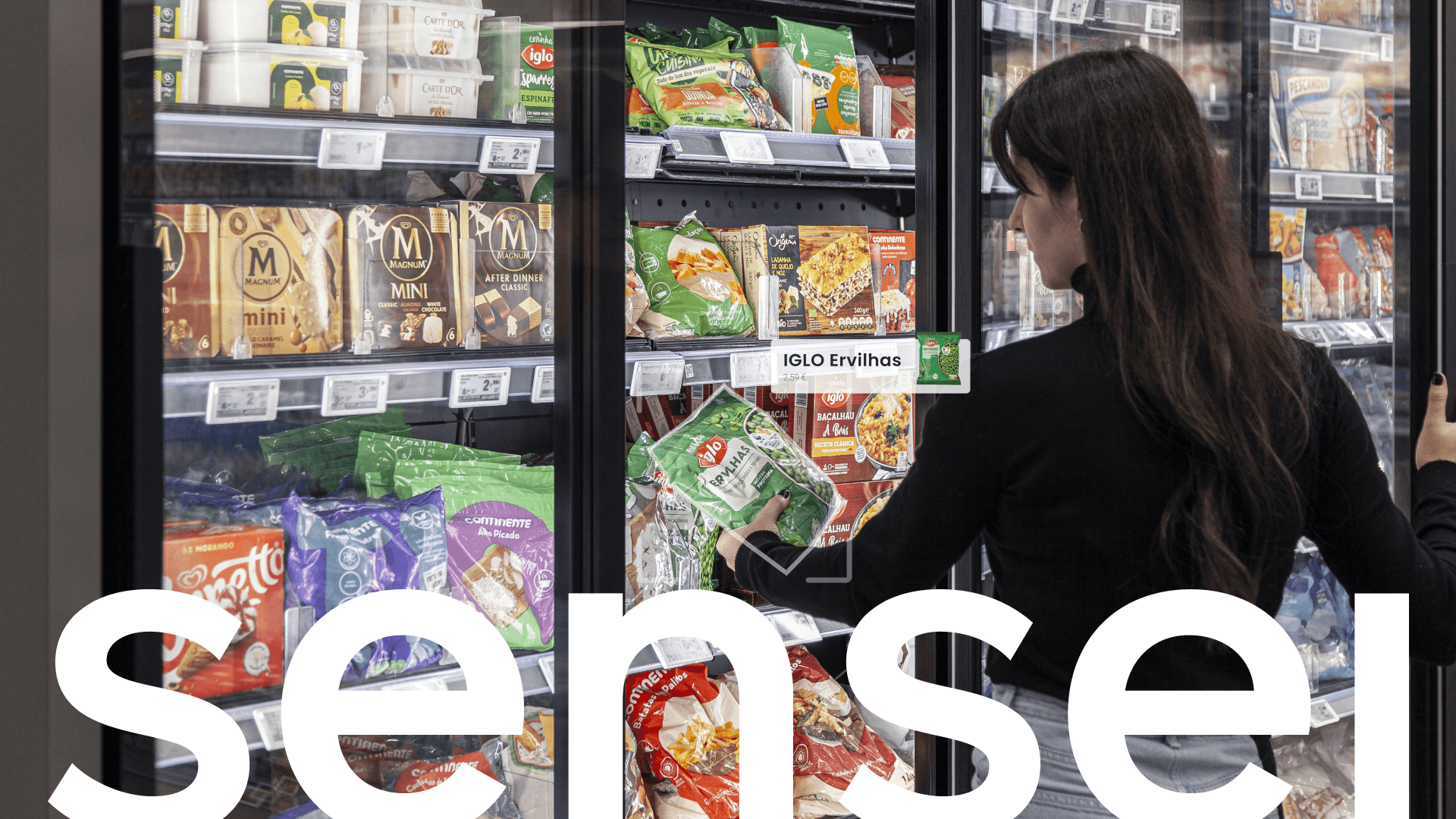
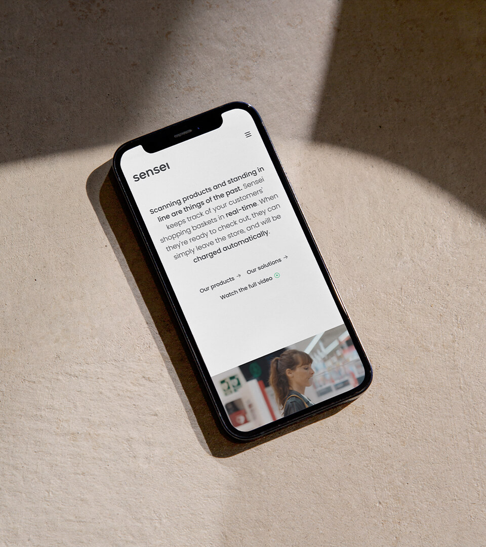
Sensei is a Portugal-based cashierless checkout startup and the leading EU provider of autonomous stores. To put it simply — scanning products and standing in lines are definitely things of the past. Sensei’s technology keeps track of the customer’s shopping baskets in real time, and once they are ready to check out, they can simply leave the store and will be charged automatically.
To have such an ambitious mission is no easy task, and it required being able to communicate it simply.


Conception
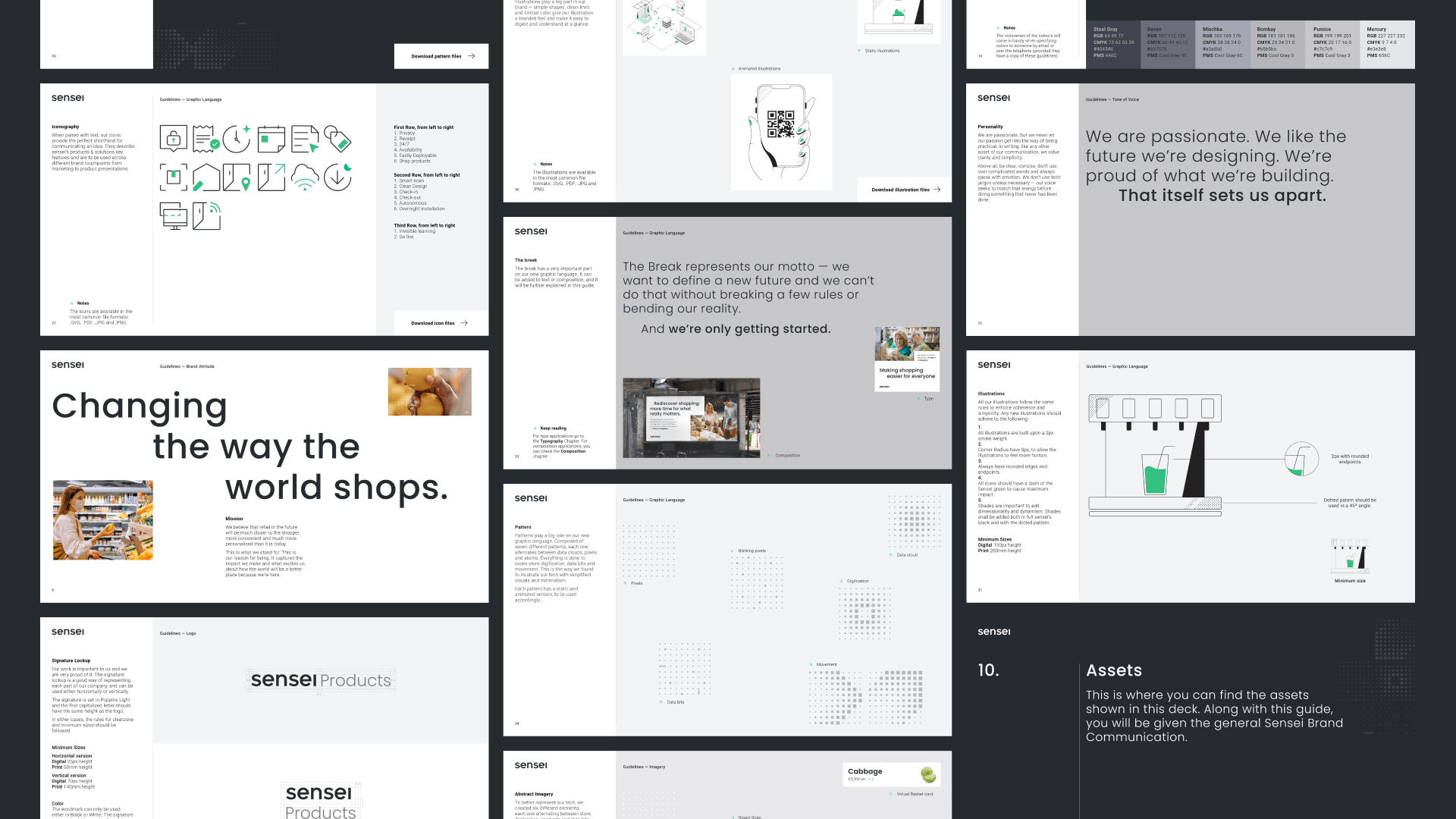
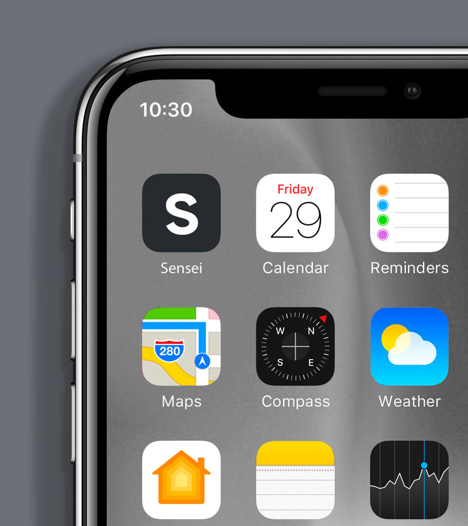
We partnered on a rebrand, from concept to execution across every business asset.
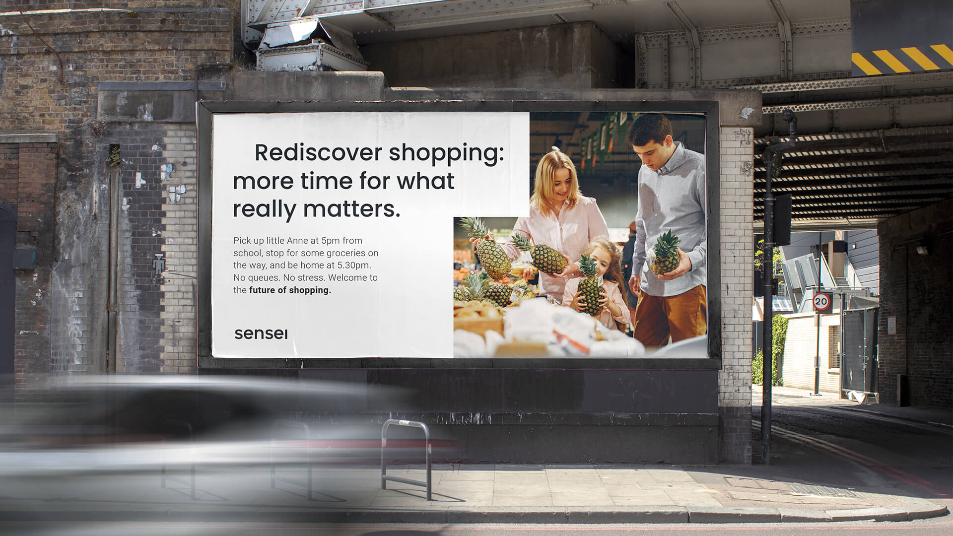
This rebrand was motivated by a simple idea — we’re changing the way the world shops. For everyone.
Every asset of the new identity carried this message. The new tone of voice — confident, direct, clear — replaces the tech jargon that no one understands. The vibrant green helps distinguish the business while giving more life and energy to it. A collection of graphic icons, illustrations and imagery were created with the purpose of illustrating this ground-breaking shopping experience.
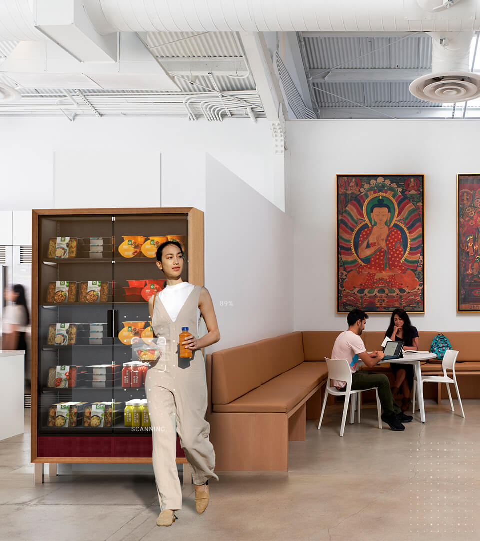
No queues. No stress. Welcome to the future of shopping.
The refined logo, tone of voice and identity embody the passionate energy at the core of Sensei’s mission. Every asset represents the brand’s vision for the future.