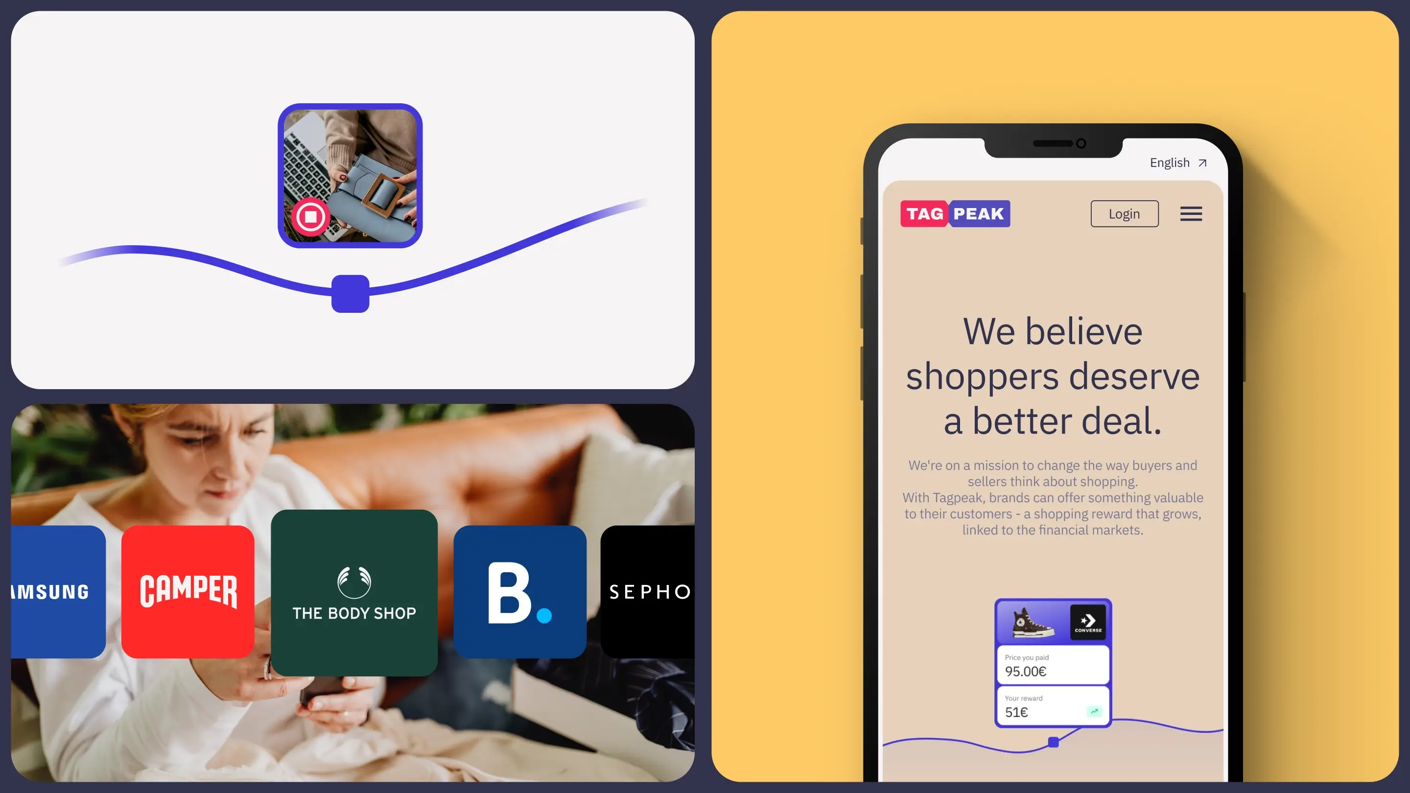
A new kind of cashback.
Making a complex reward feel simple and worth trusting. Tagpeak offers a different kind of cashback: instead of a fixed return, rewards are invested in the stock market, with the potential to grow. But that potential came with friction: the existing website felt outdated and lacked credibility, and the platform flow made simple actions feel unnecessarily complex, especially on mobile.
Conception
Tagpeak needed more than a refresh. They needed a product and website that felt fast, clear and trustworthy, without losing the excitement of what makes them different.
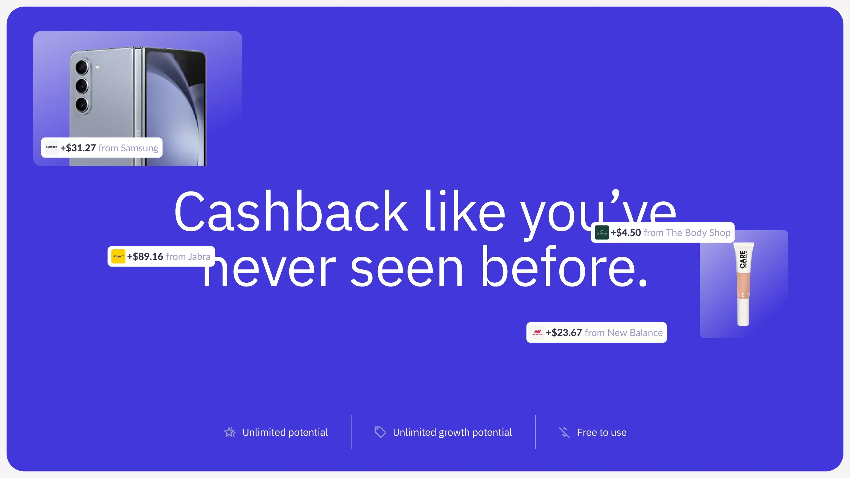
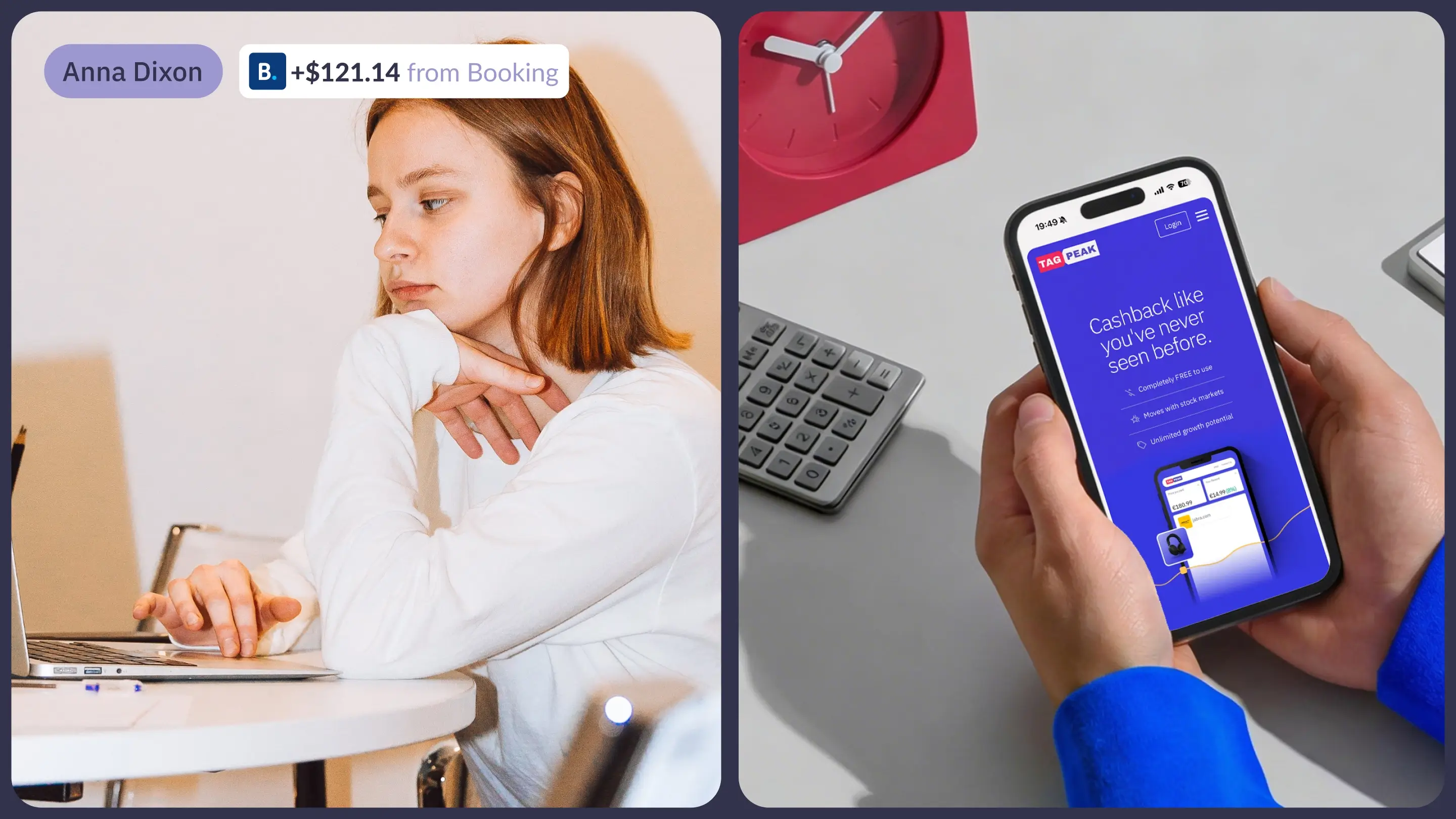
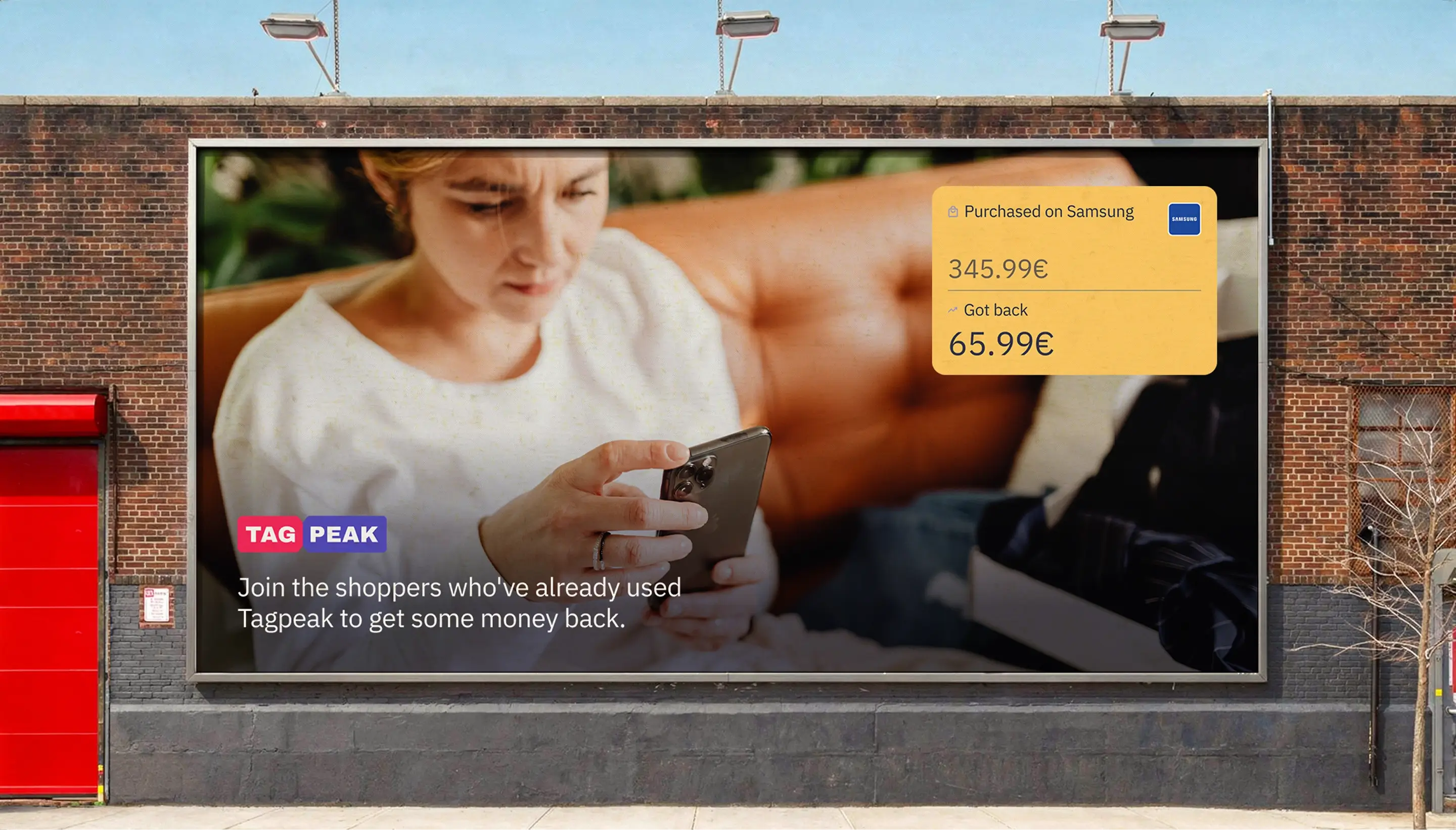
If the reward can grow, the experience should feel rewarding.We reframed the product around a simple idea: A new kind of cashback. Shop rewards that can grow. Instead of over-explaining the mechanics, we focused on making the outcome tangible. Real scenarios, real users, real wins; showing what’s possible when cashback isn’t capped.
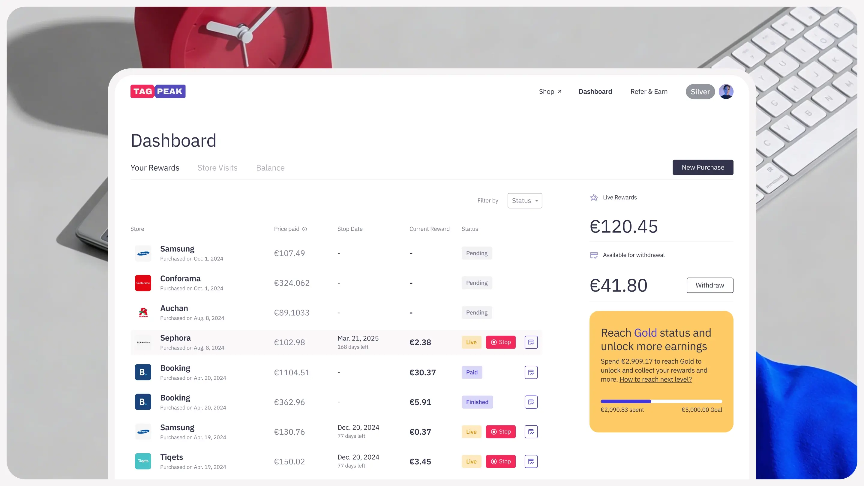
Aligning the entire experience around simplicity and speed.
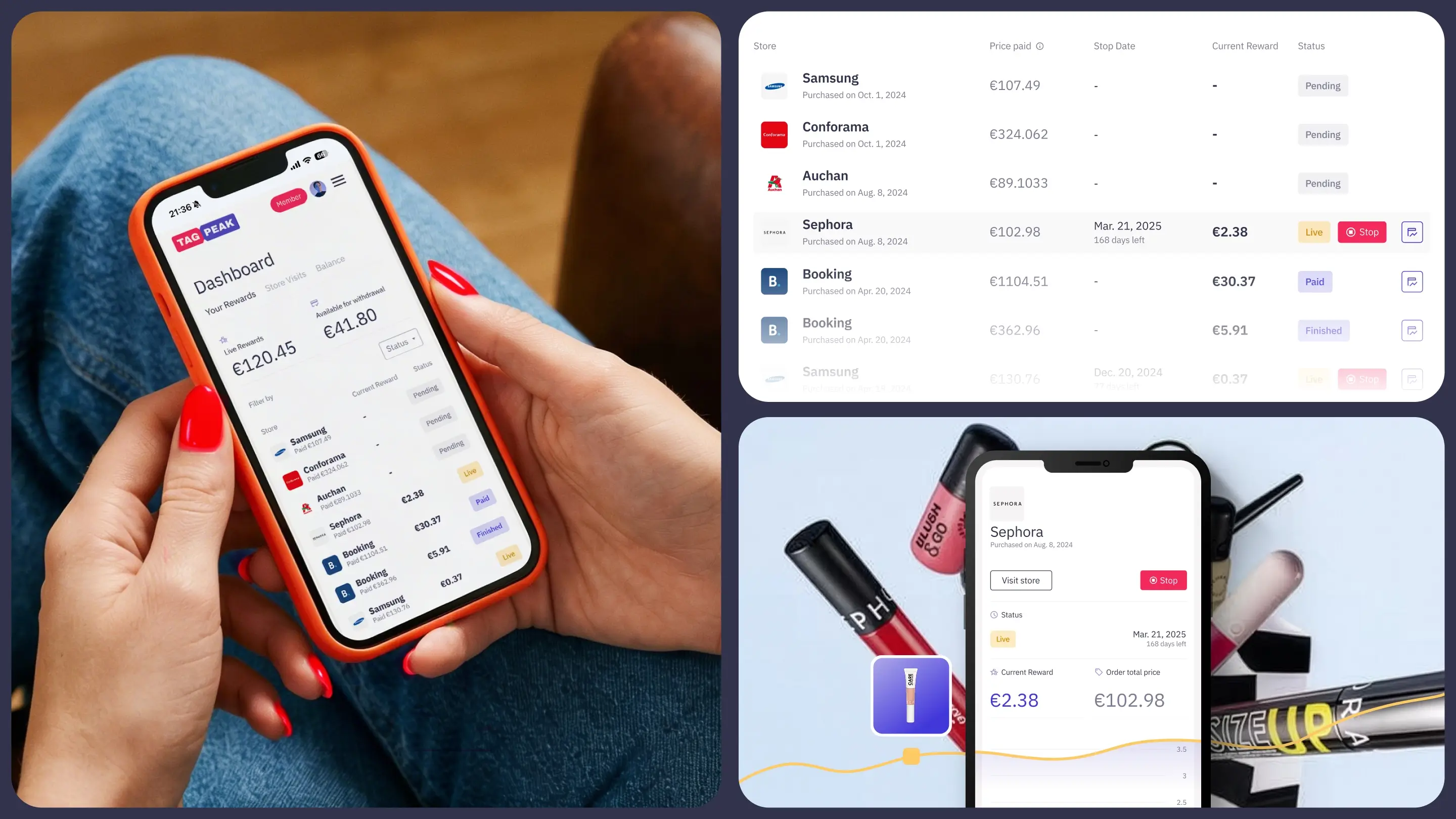
We redesigned both the website and the platform, aligning the entire experience around simplicity and speed. The product flow was stripped down to its essentials, removing unnecessary steps and making key actions feel instant. The interface puts rewards front and centre. Users don’t need to search for value; they see it immediately.
Visually, we moved away from playful, cartoon-like elements to a more confident and modern system. Clean layouts create clarity, while bold colours inject energy and optimism.
Following the launch, Tagpeak reported their best month ever, in both total purchases and cashback returns. A smoother experience didn’t just improve usability. It reinforced trust, and unlocked growth.