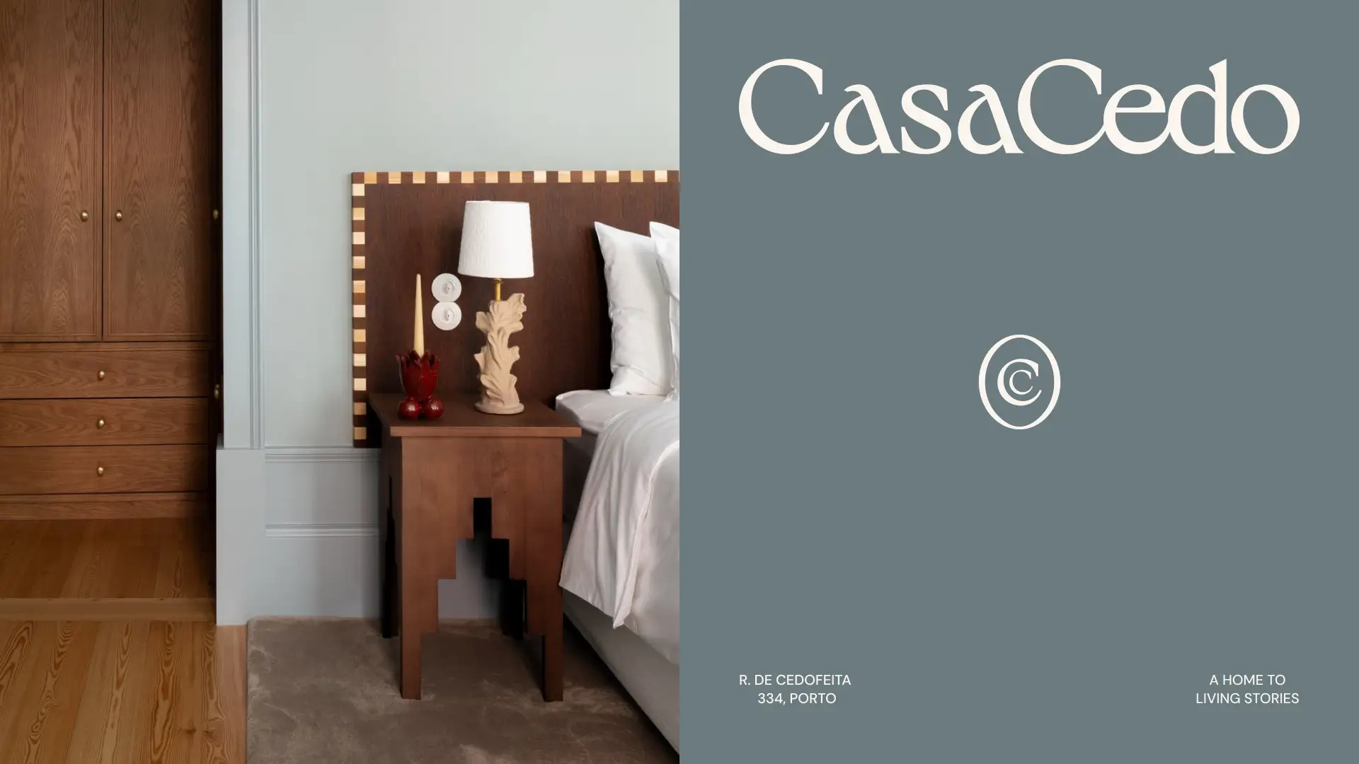

A home to living stories
Creating a boutique hotel that feels like a home. Casa Cedo was born from a shared dream. After years of travelling the world together, its founders set out to create the kind of place they had always searched for themselves: intimate, thoughtful and deeply connected to its surroundings.

Conception
Located in the heart of Porto, the new eight-room guesthouse entered a growing market of boutique hospitality. To stand out, it needed more than beautiful interiors. It needed a brand capable of expressing the warmth, personality and sense of belonging that shaped every detail of the experience. The challenge was to position Casa Cedo as more than a place to stay, but as a place to truly experience Porto.
The founders had already written the first chapter. Through years of travel, collecting objects, ideas and inspiration, they had created a house filled with personal meaning. Our role was to create a brand that invited guests to do the same.
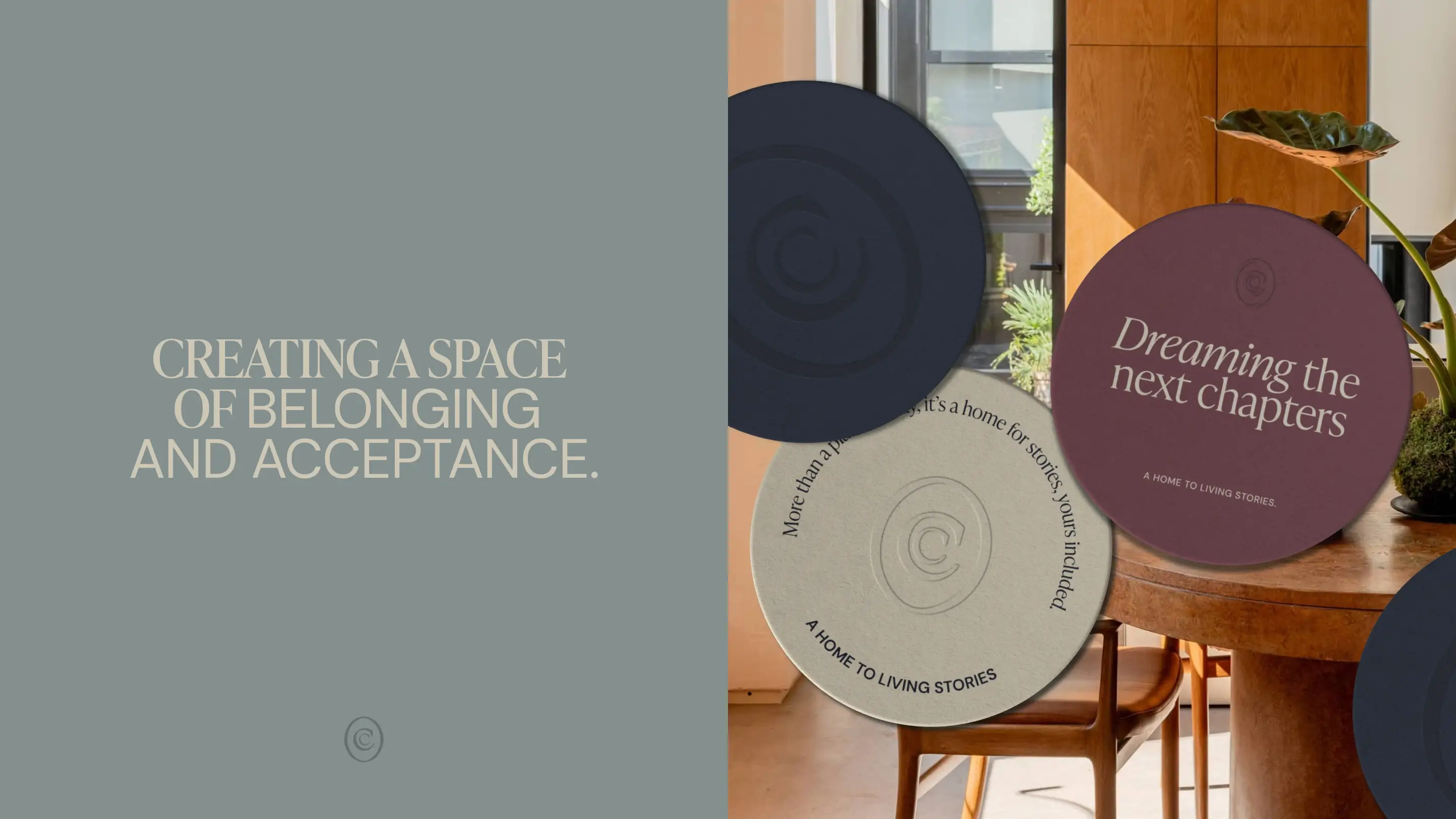
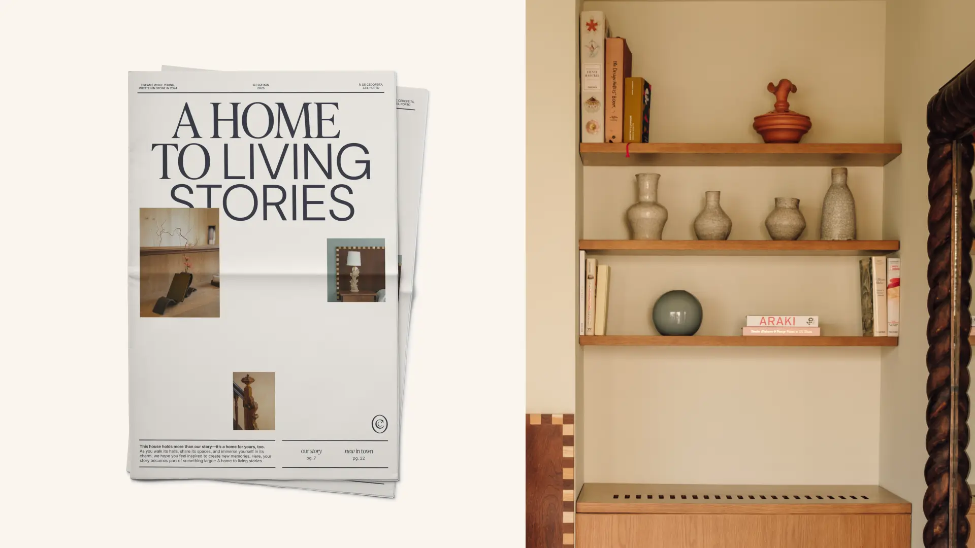
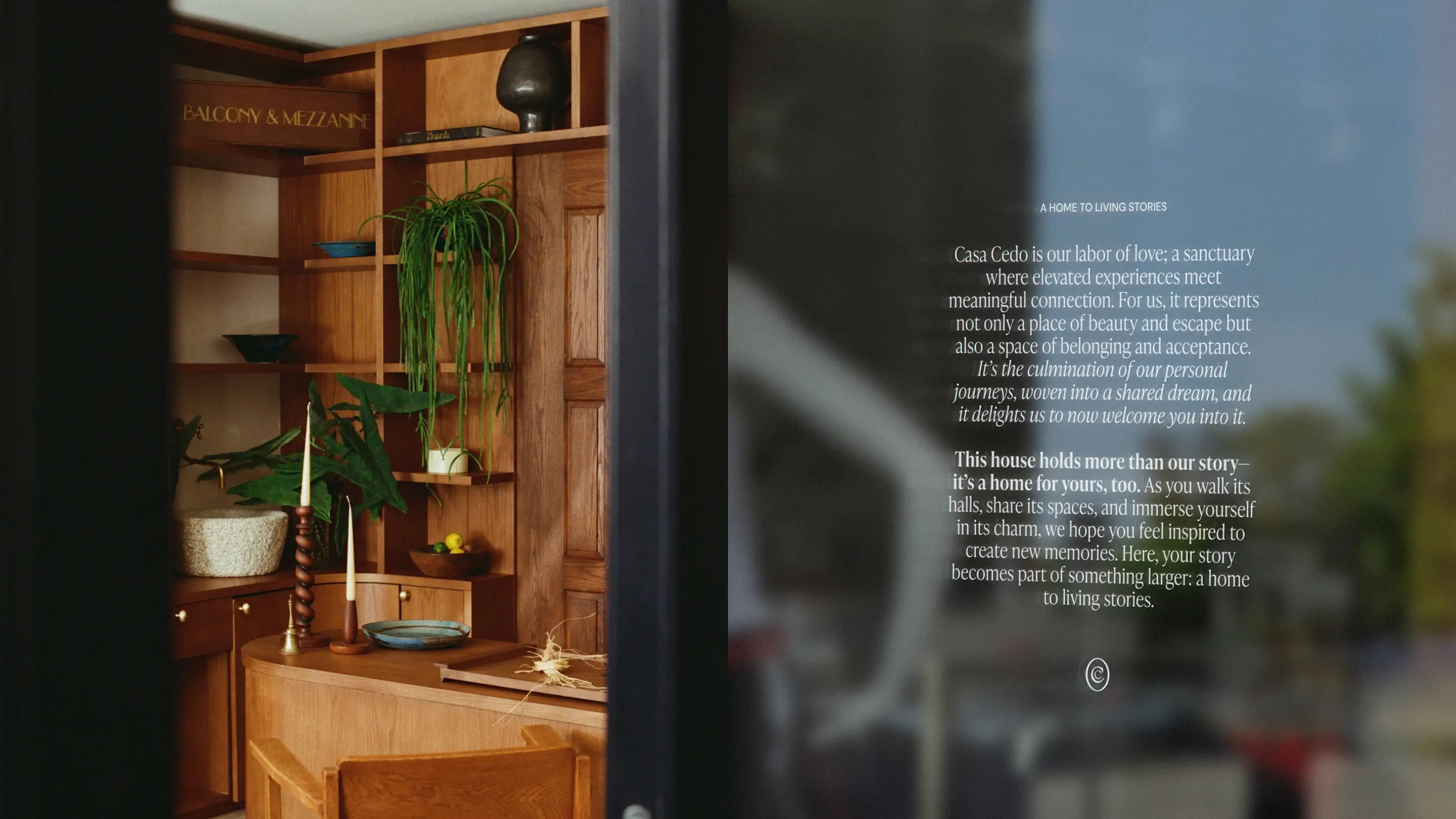
Rather than positioning Casa Cedo as a luxury destination, we framed it as a home for meaningful experiences. A place where stories begin, connections form and Porto reveals itself through a more personal lens. The result was a simple idea that guided the entire project: This house holds more than our story. It’s a home for yours, too.
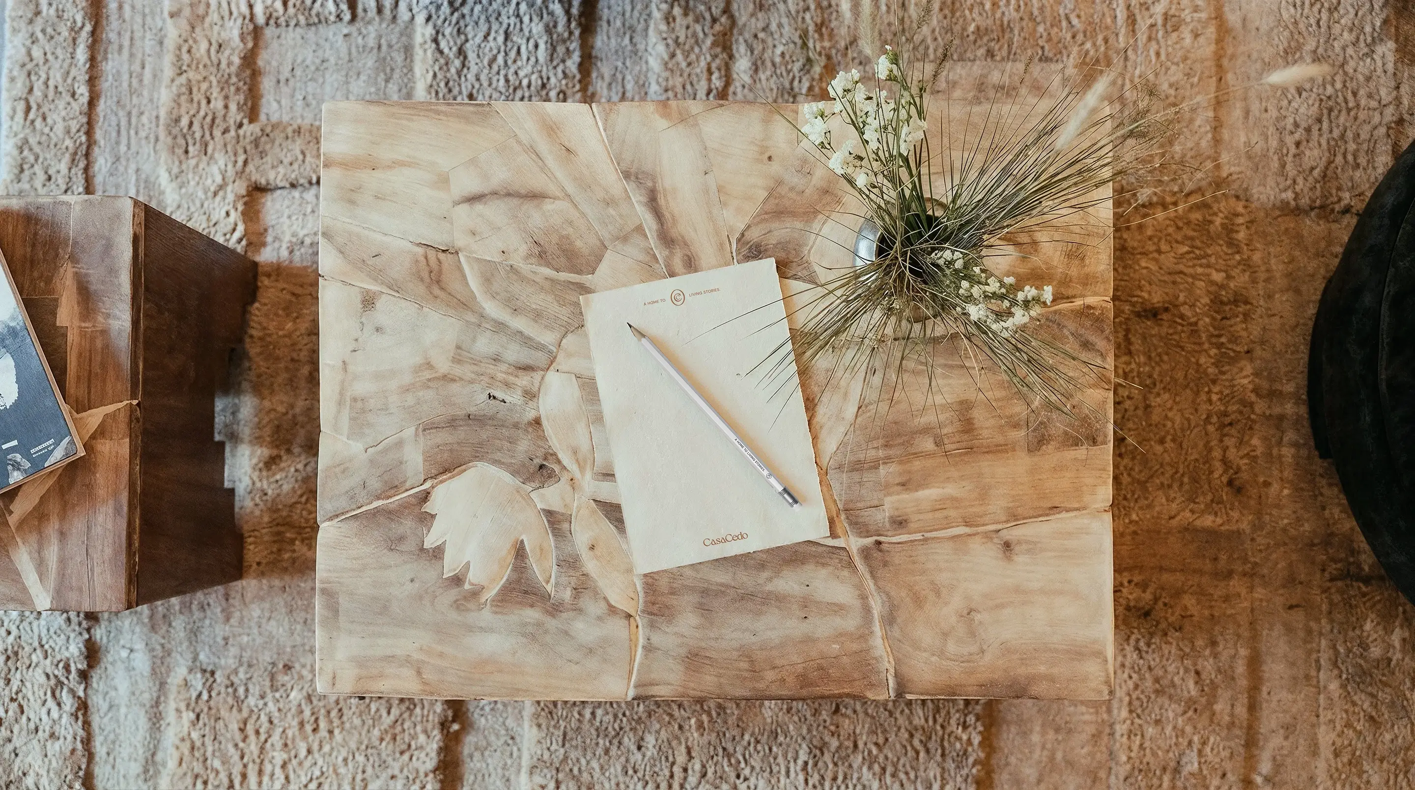
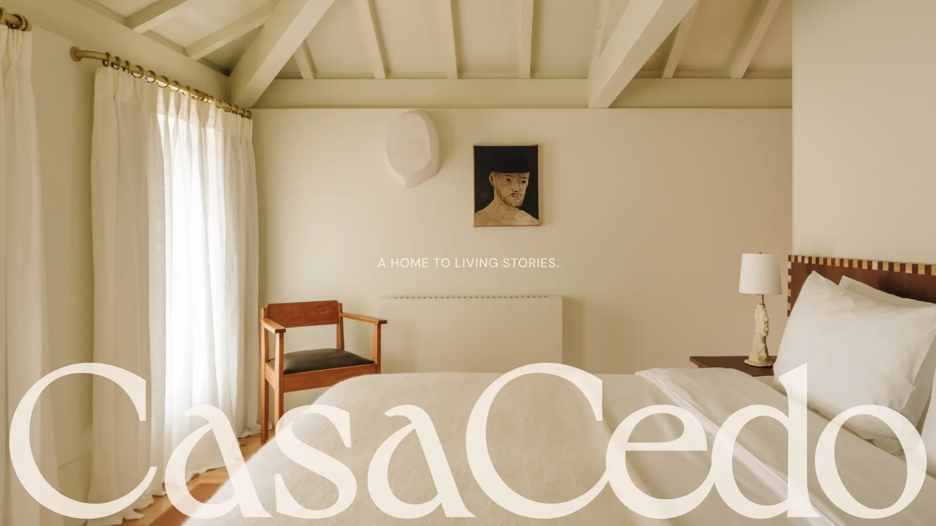
Creating a boutique hotel that feels like a home.
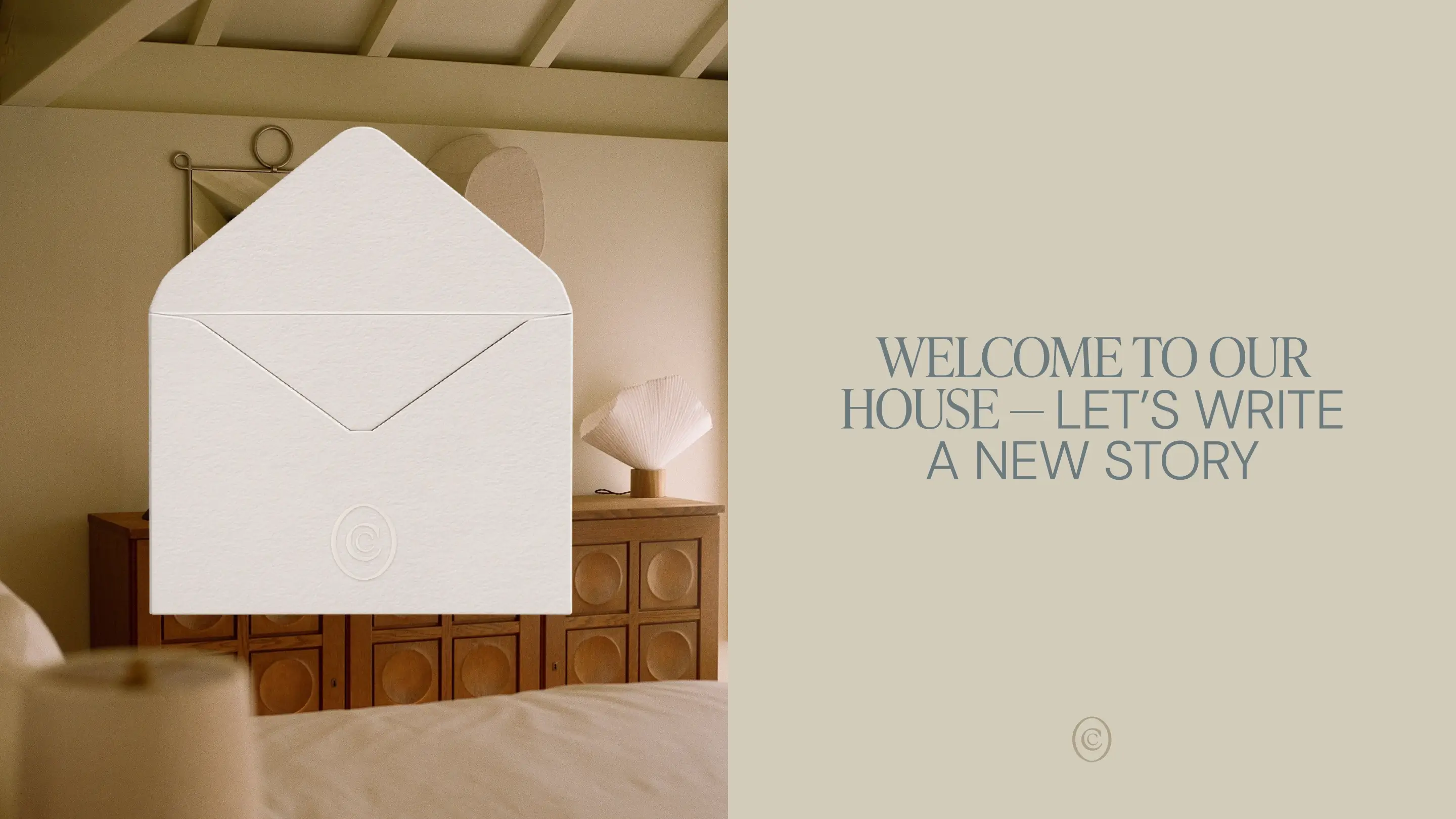
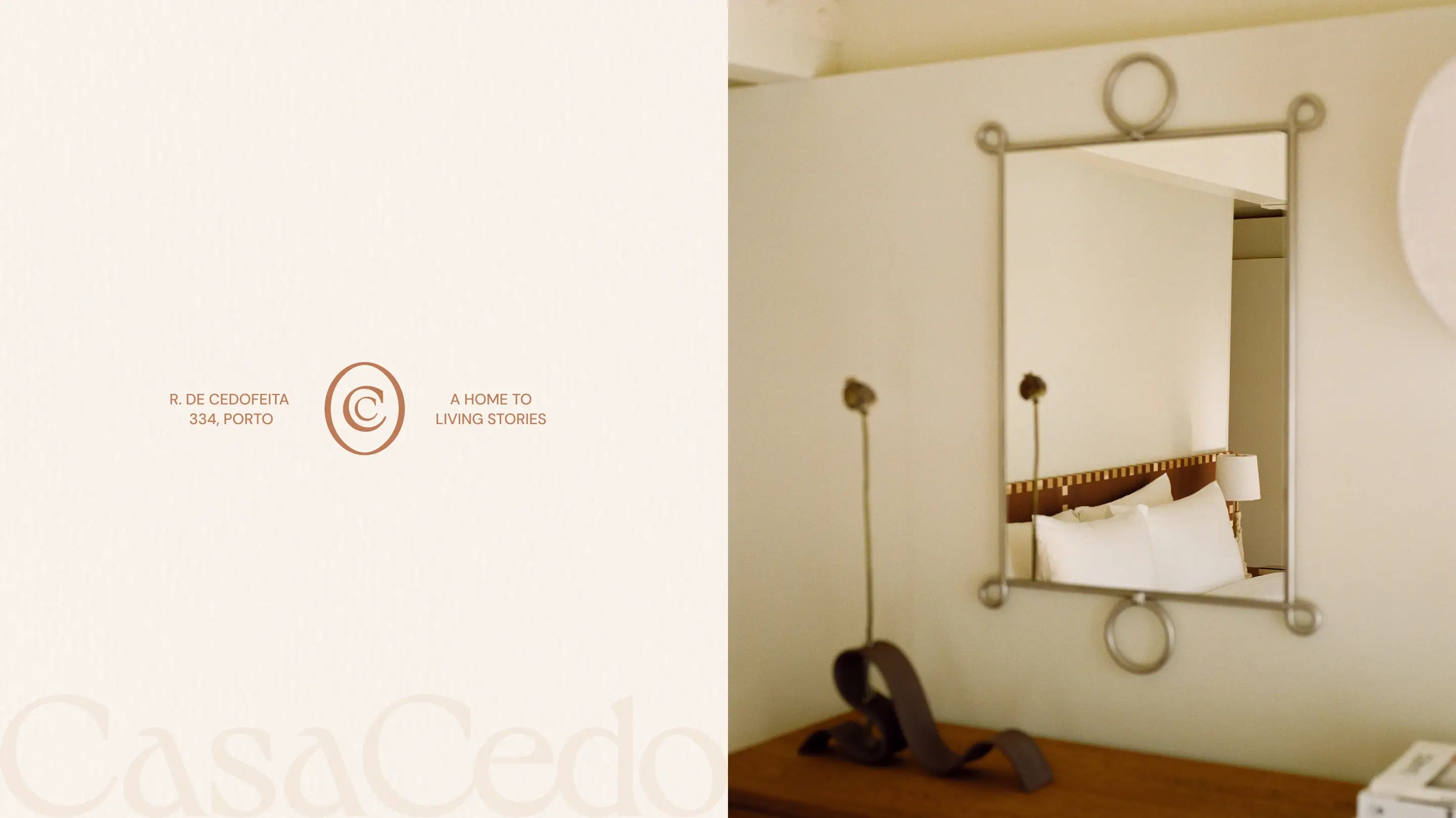
At the centre of the identity sits a discreet monogram built from the two Cs of Casa Cedo. Quiet and refined, it reflects the hotel’s character: confident without being showy, elevated without feeling distant.
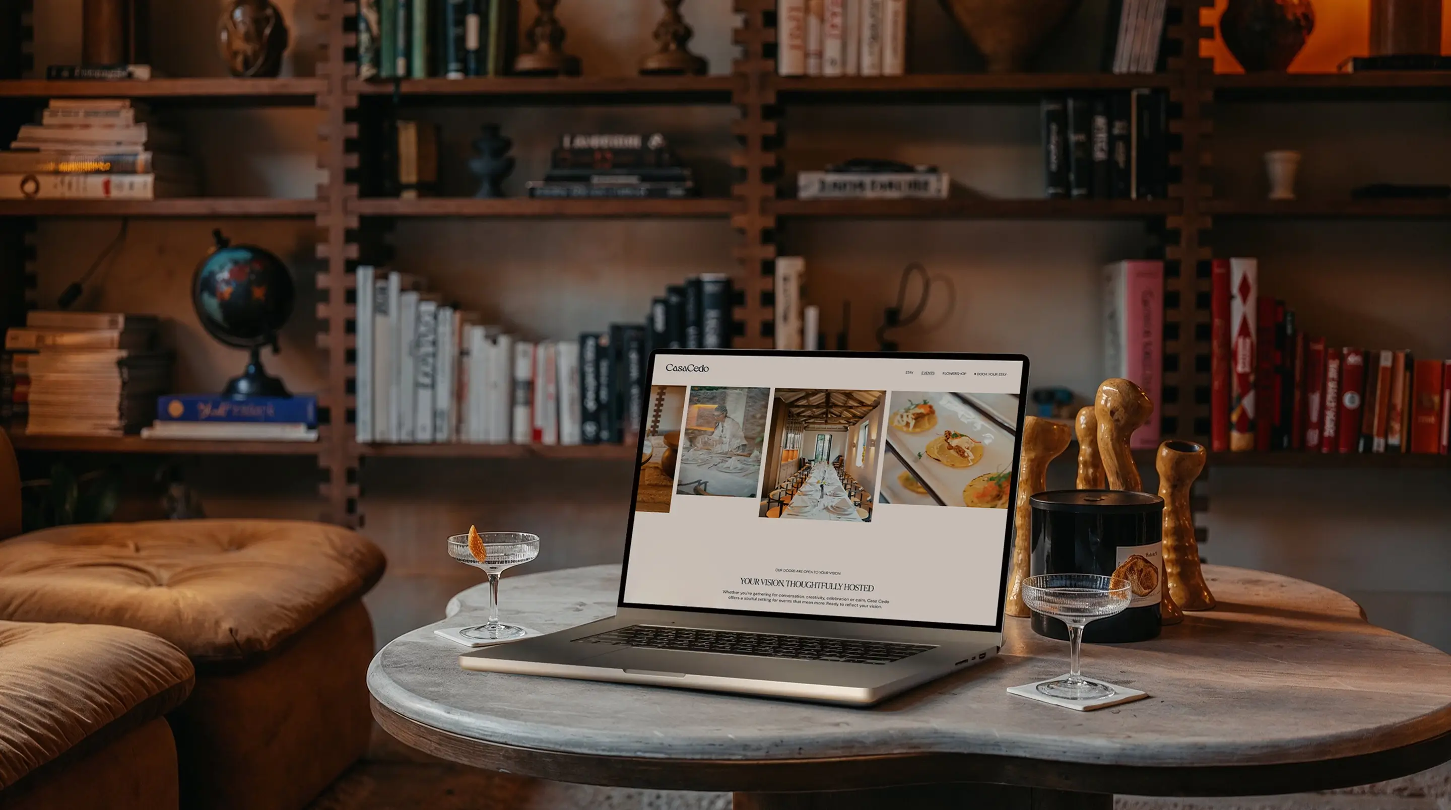
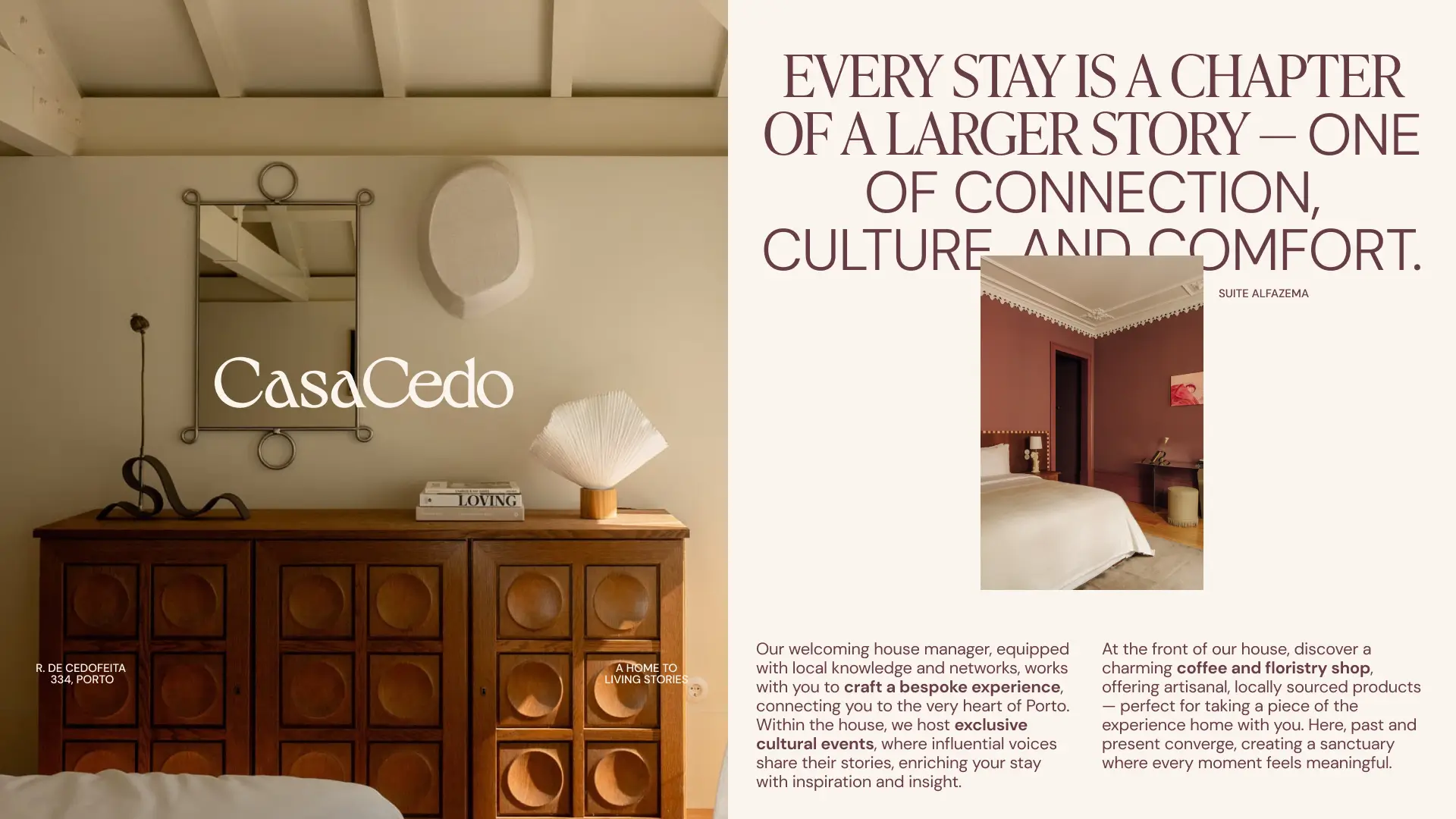
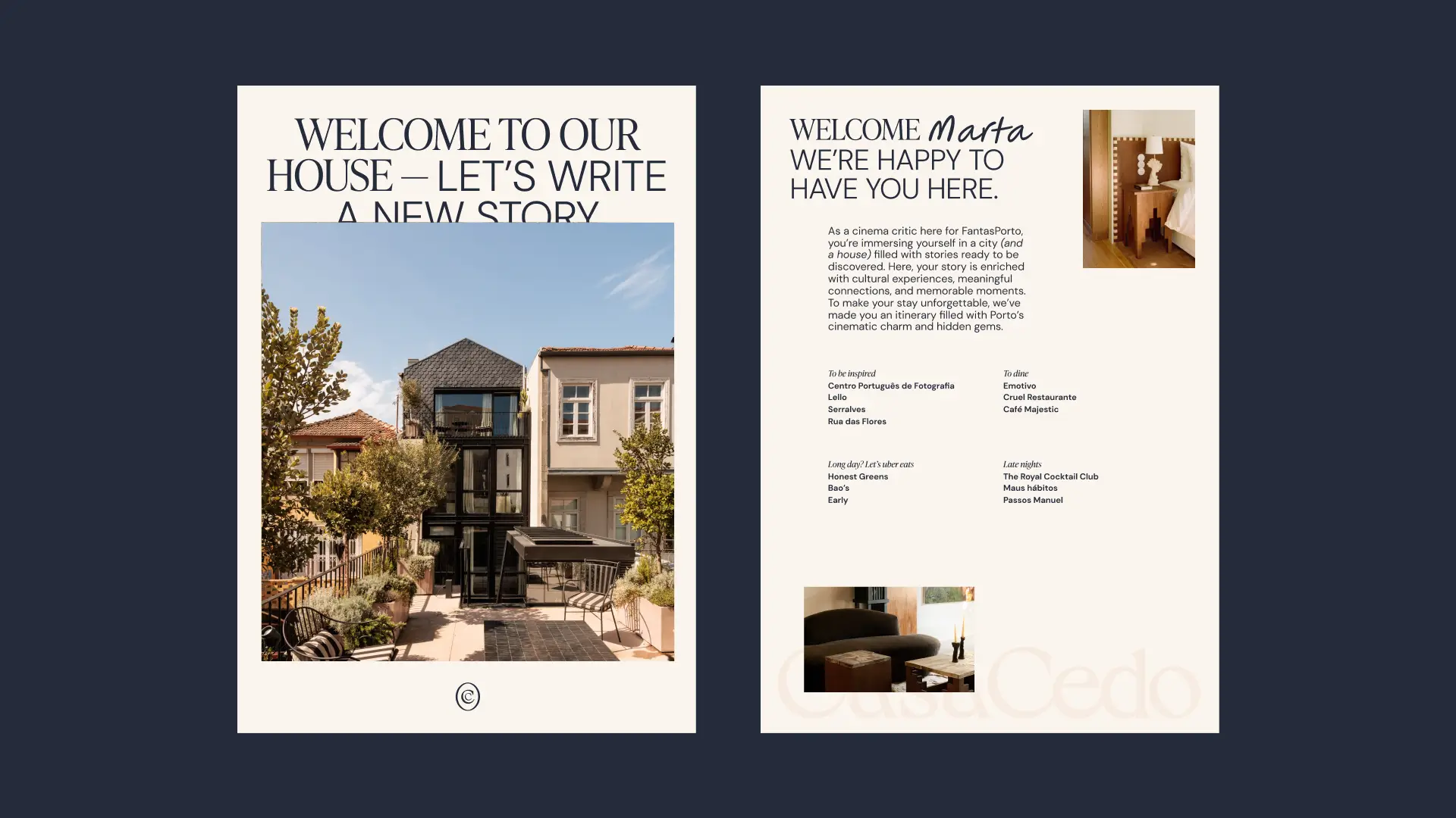
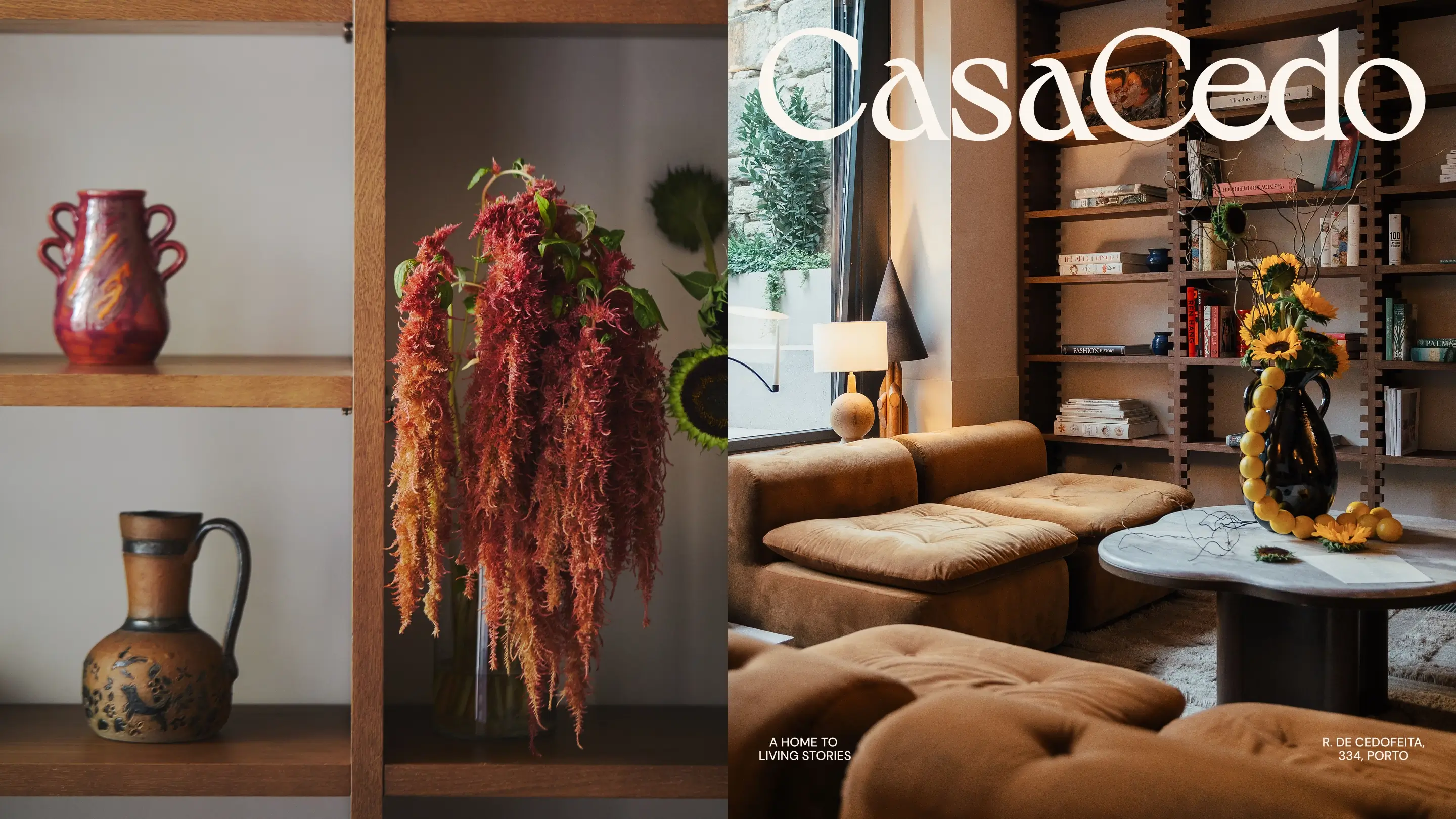
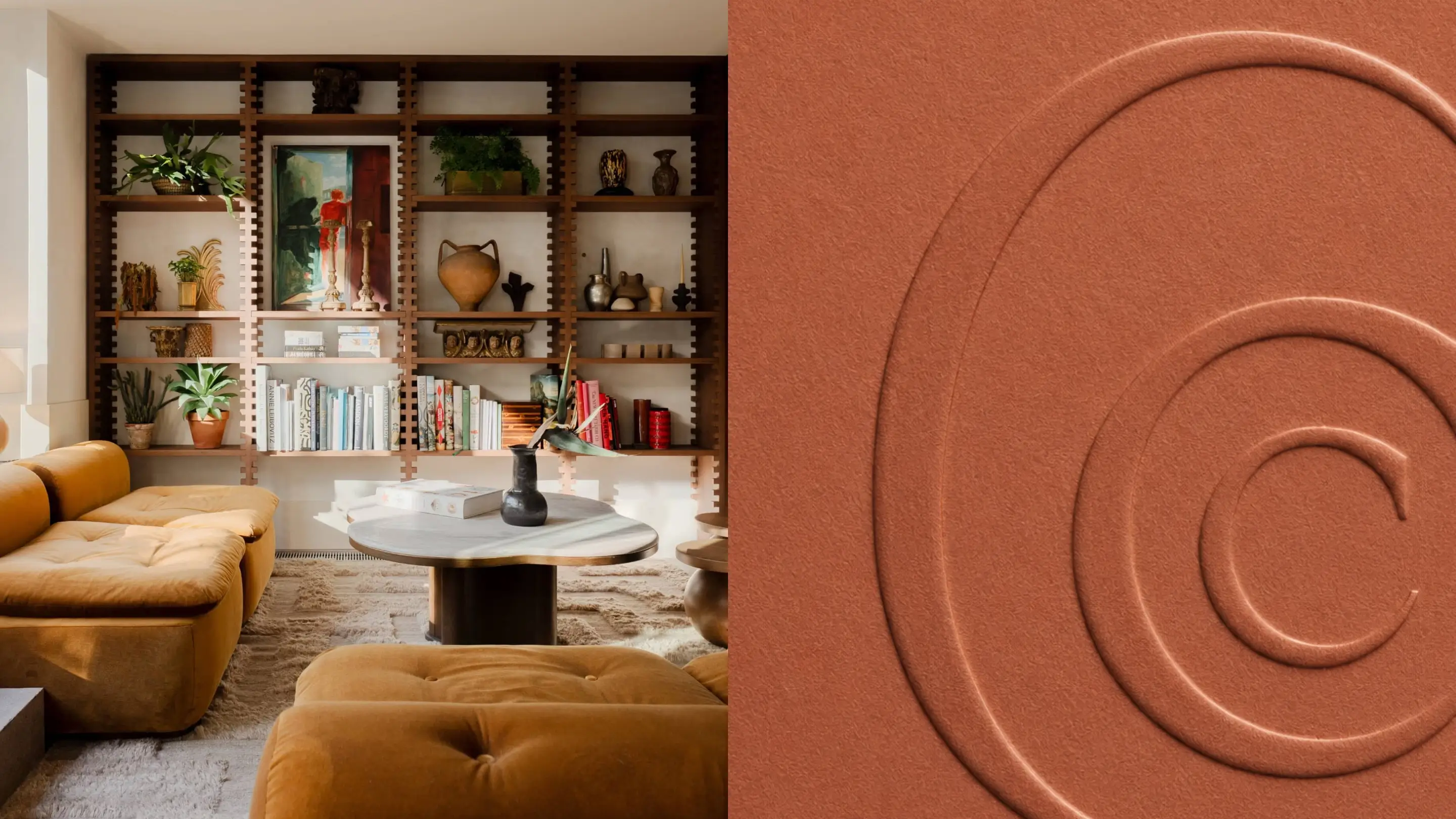
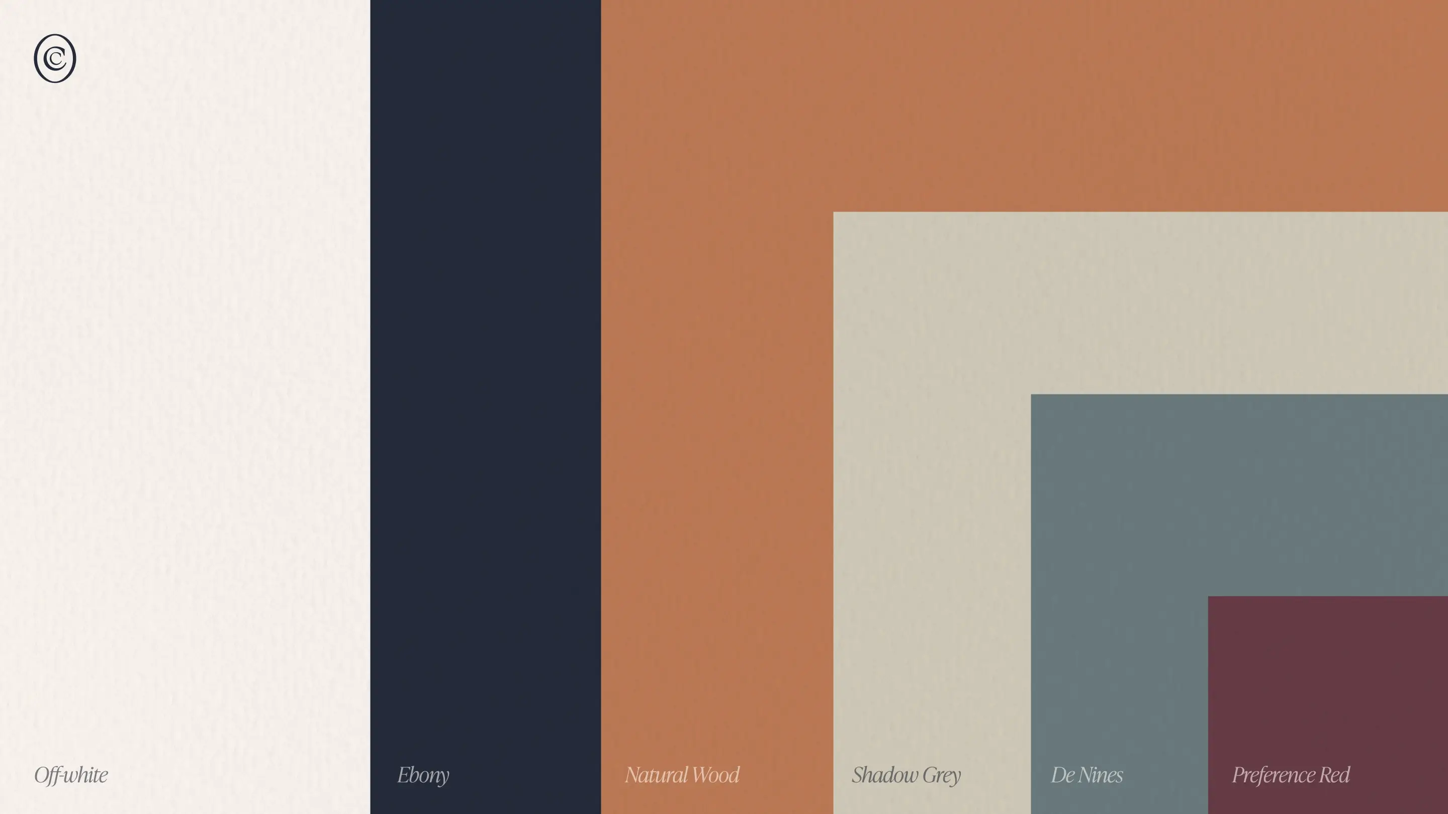
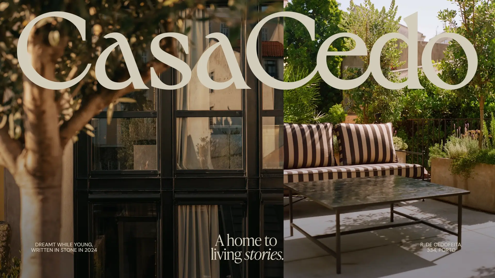
The visual system draws inspiration directly from the house itself. Each floor carries its own distinctive colour palette, while every room is named after a flower. These references became part of the brand language, creating a subtle connection between the physical experience and the identity. For the website, we adopted an editorial approach. Large-scale photography, generous pacing and carefully curated content mirror the feeling of walking through the house itself. Less focused on selling rooms, more focused on inviting guests into the story.
The result is a brand that feels personal, timeless and unmistakably Porto.