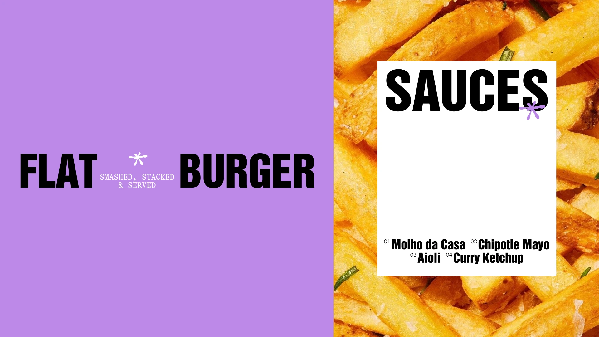
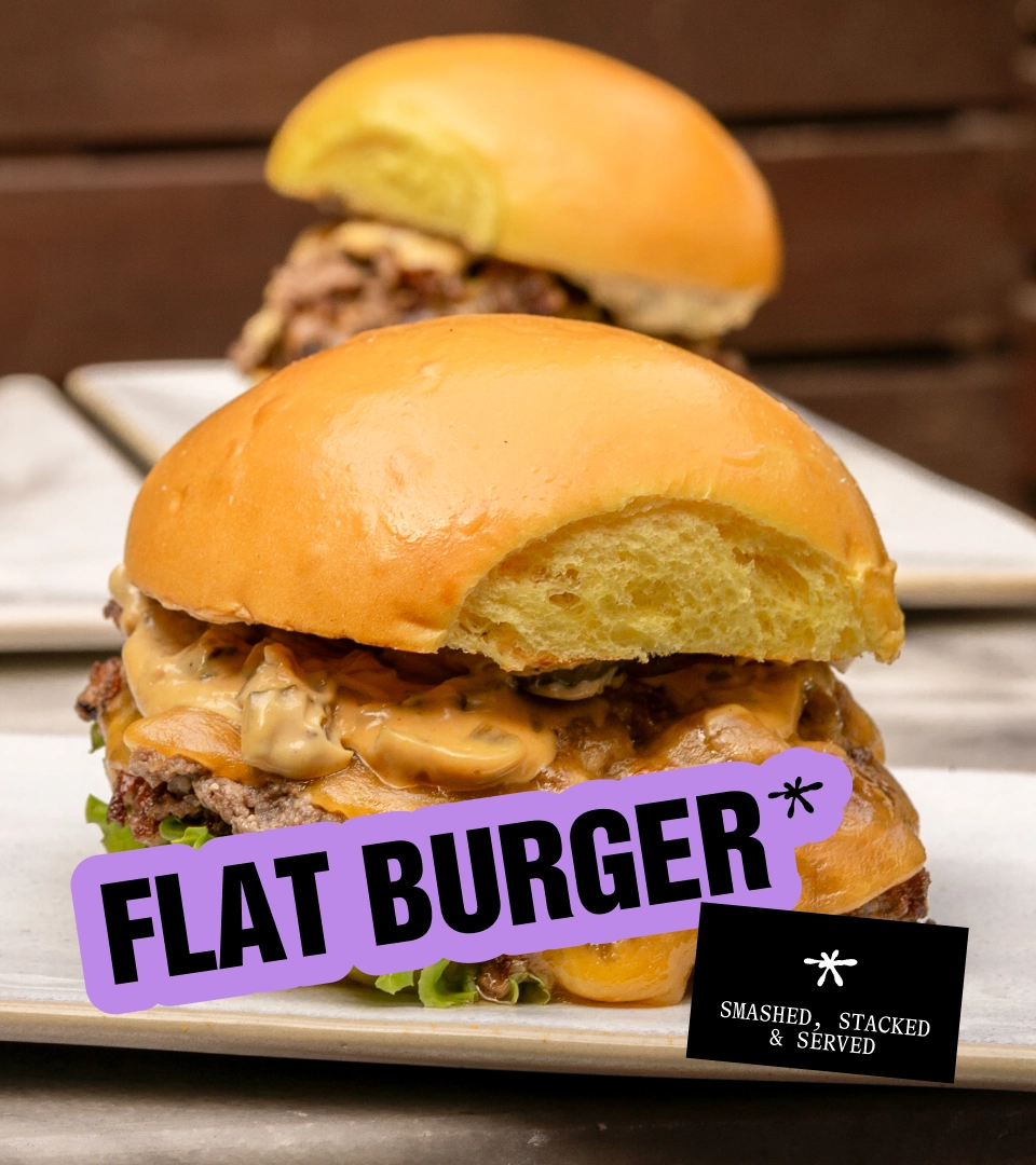
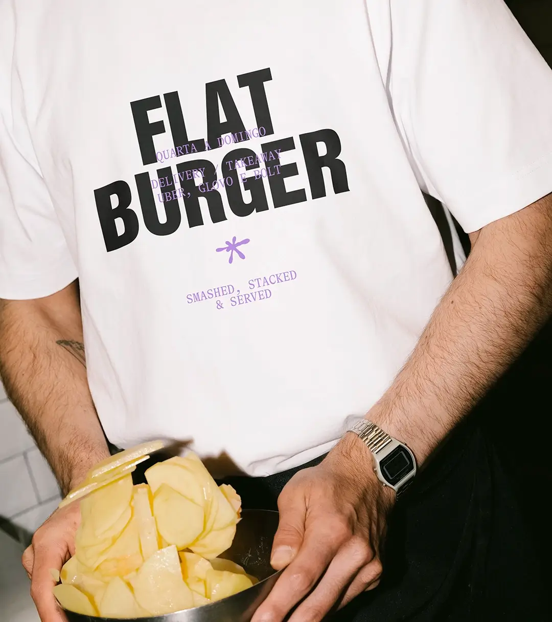
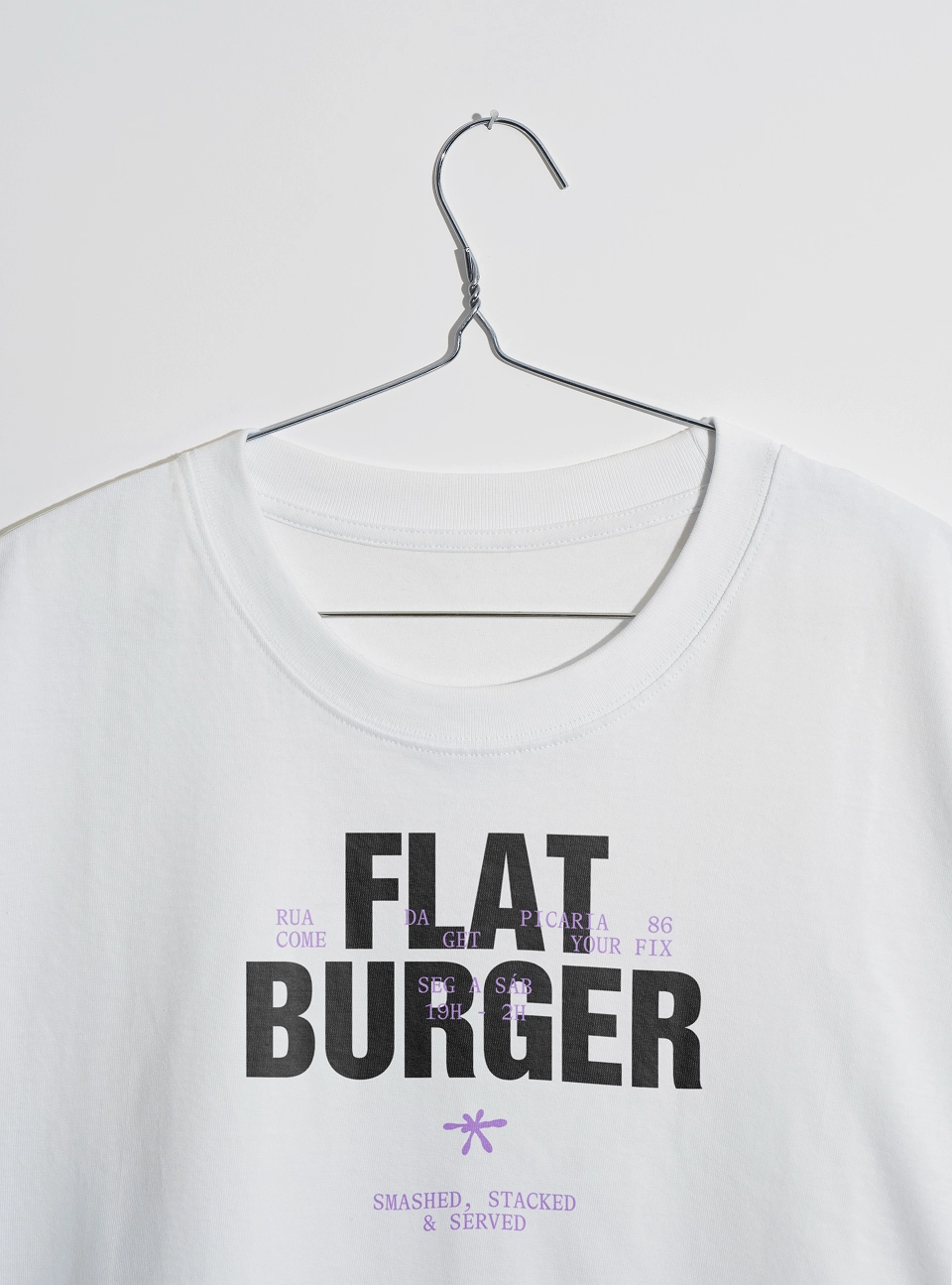
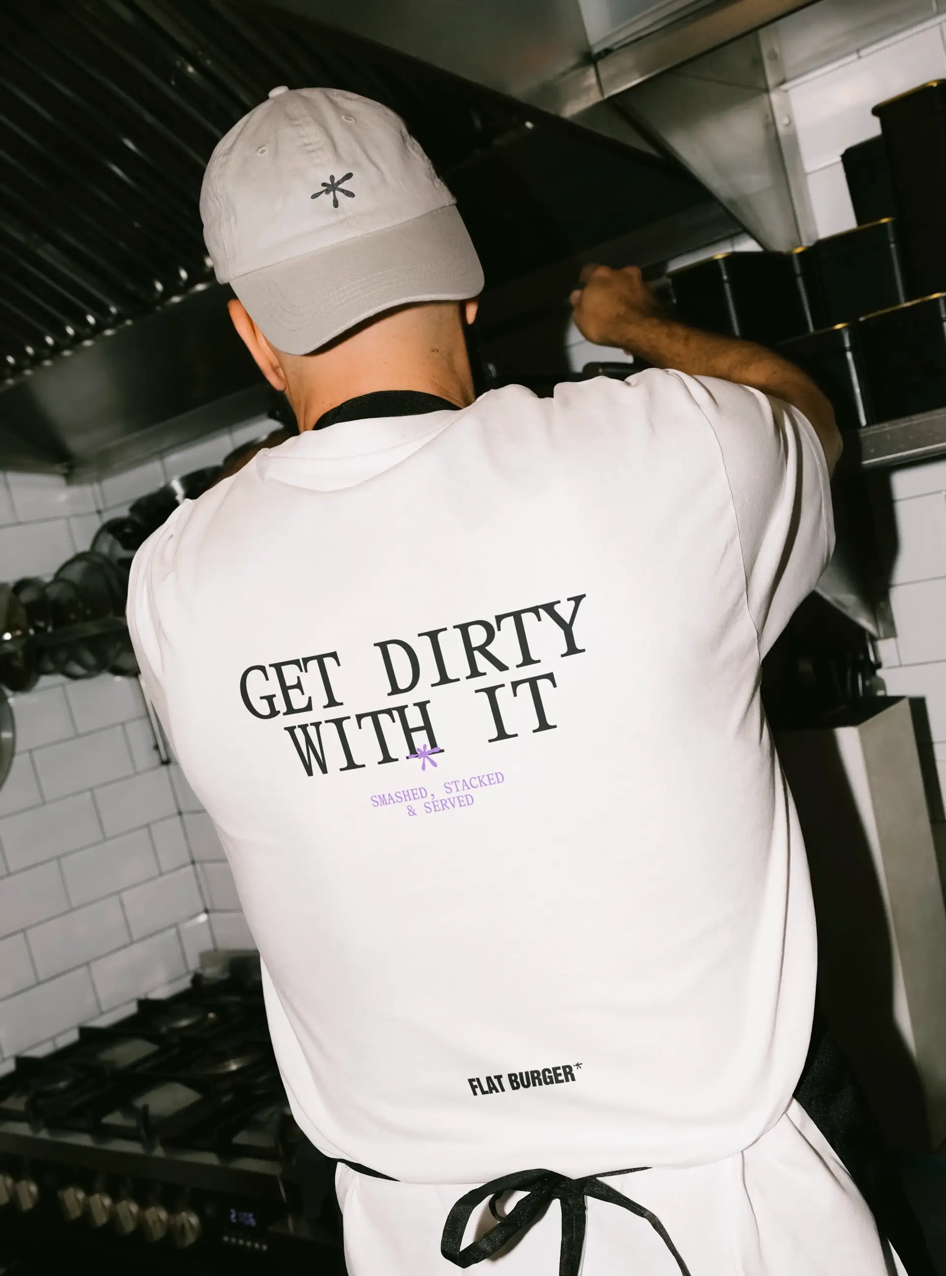
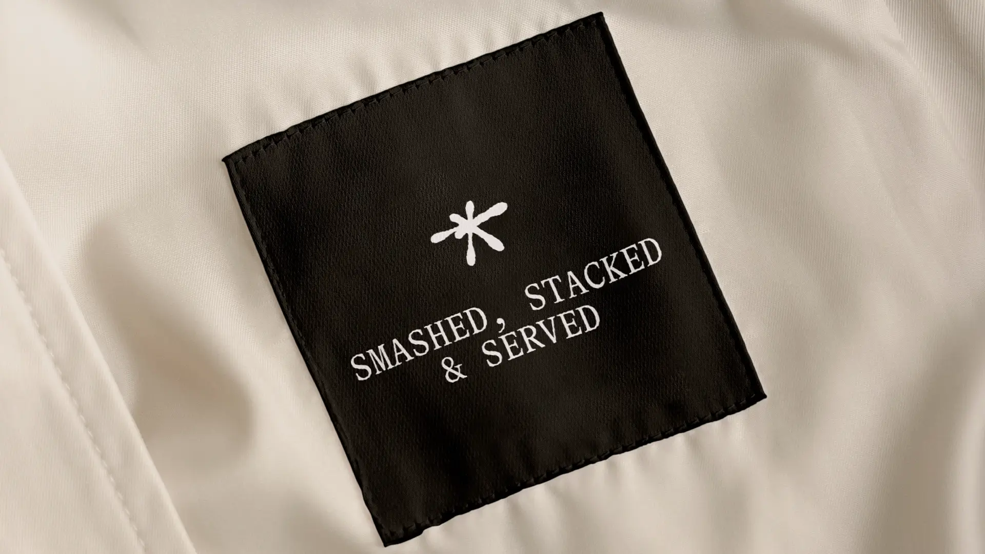
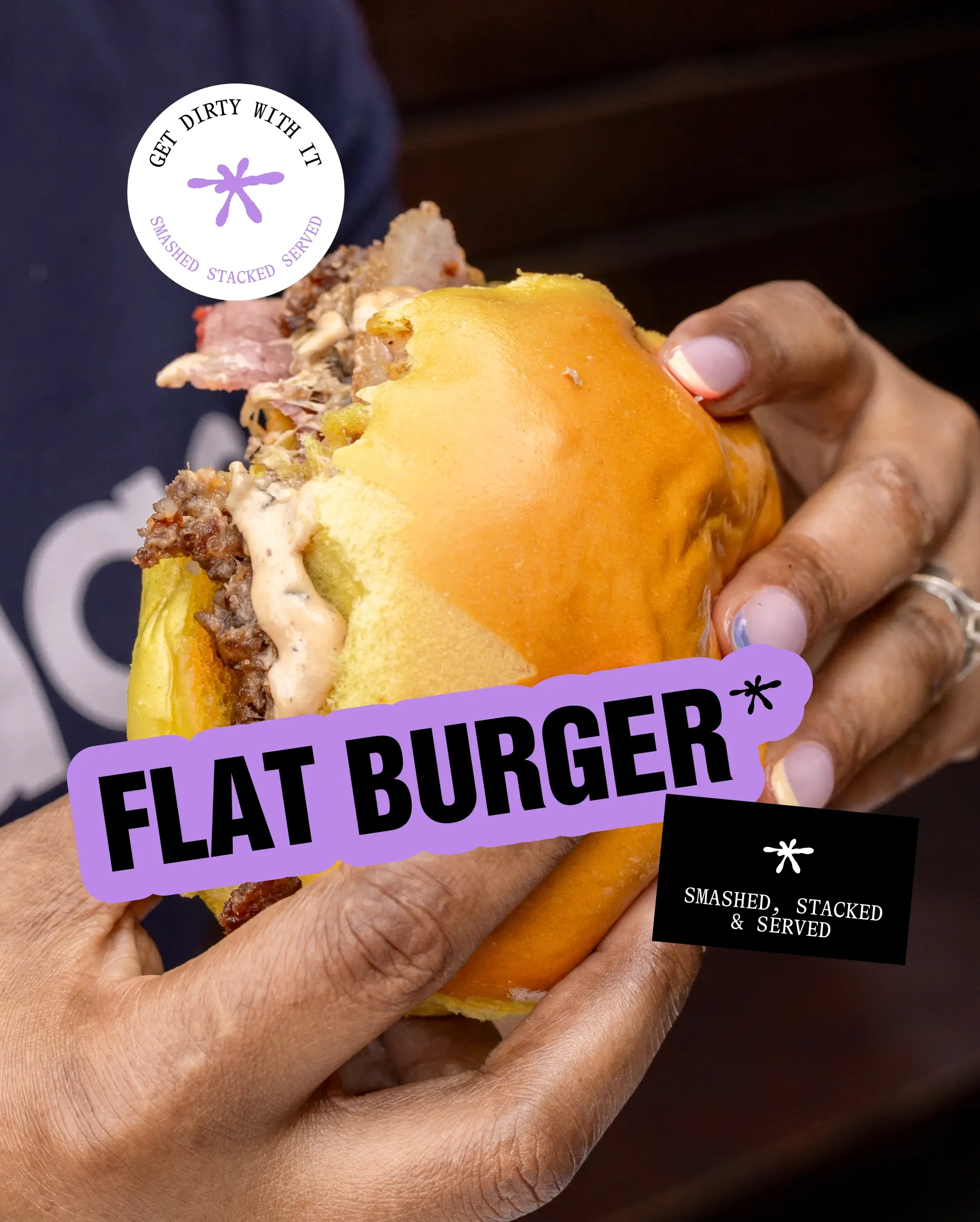
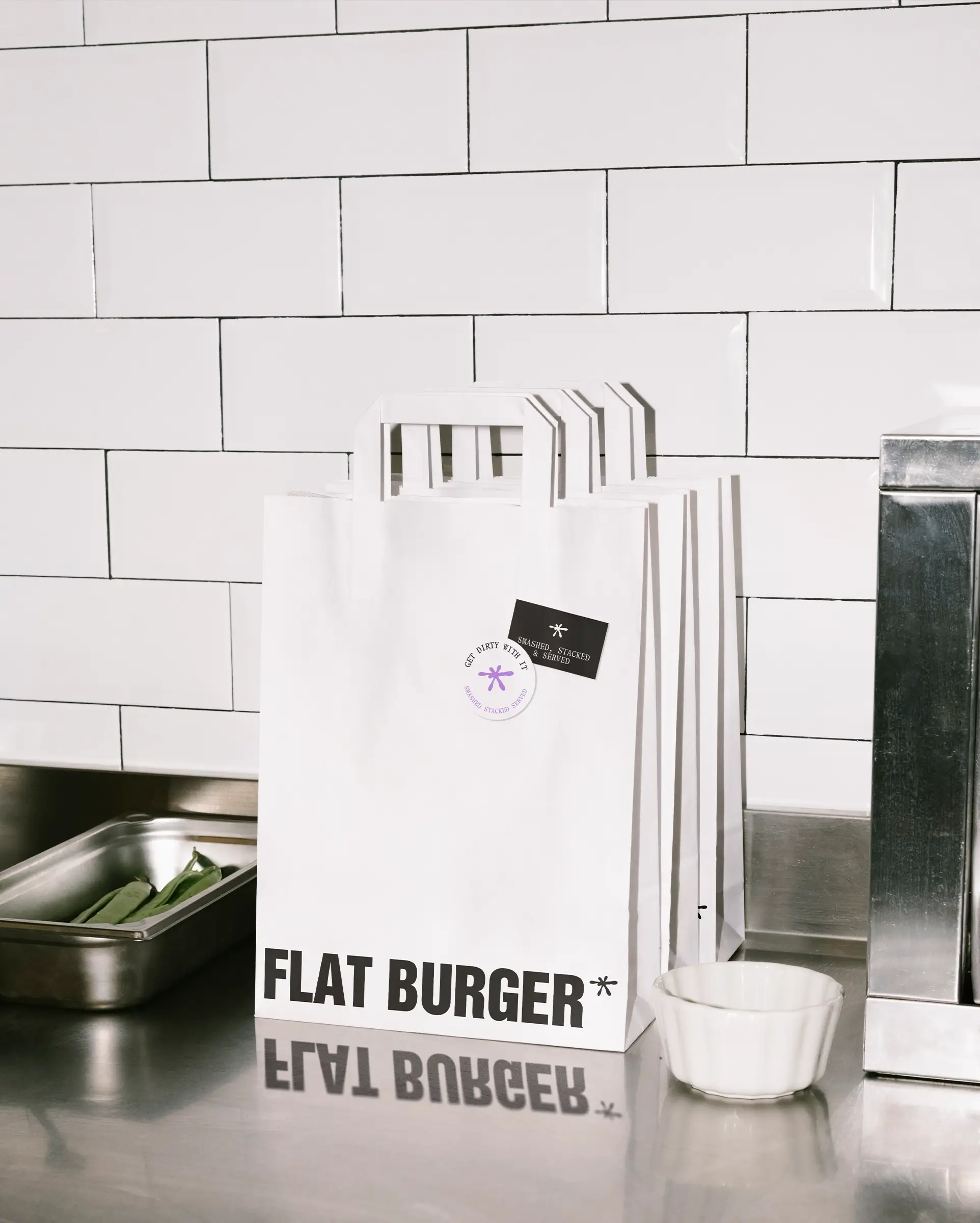
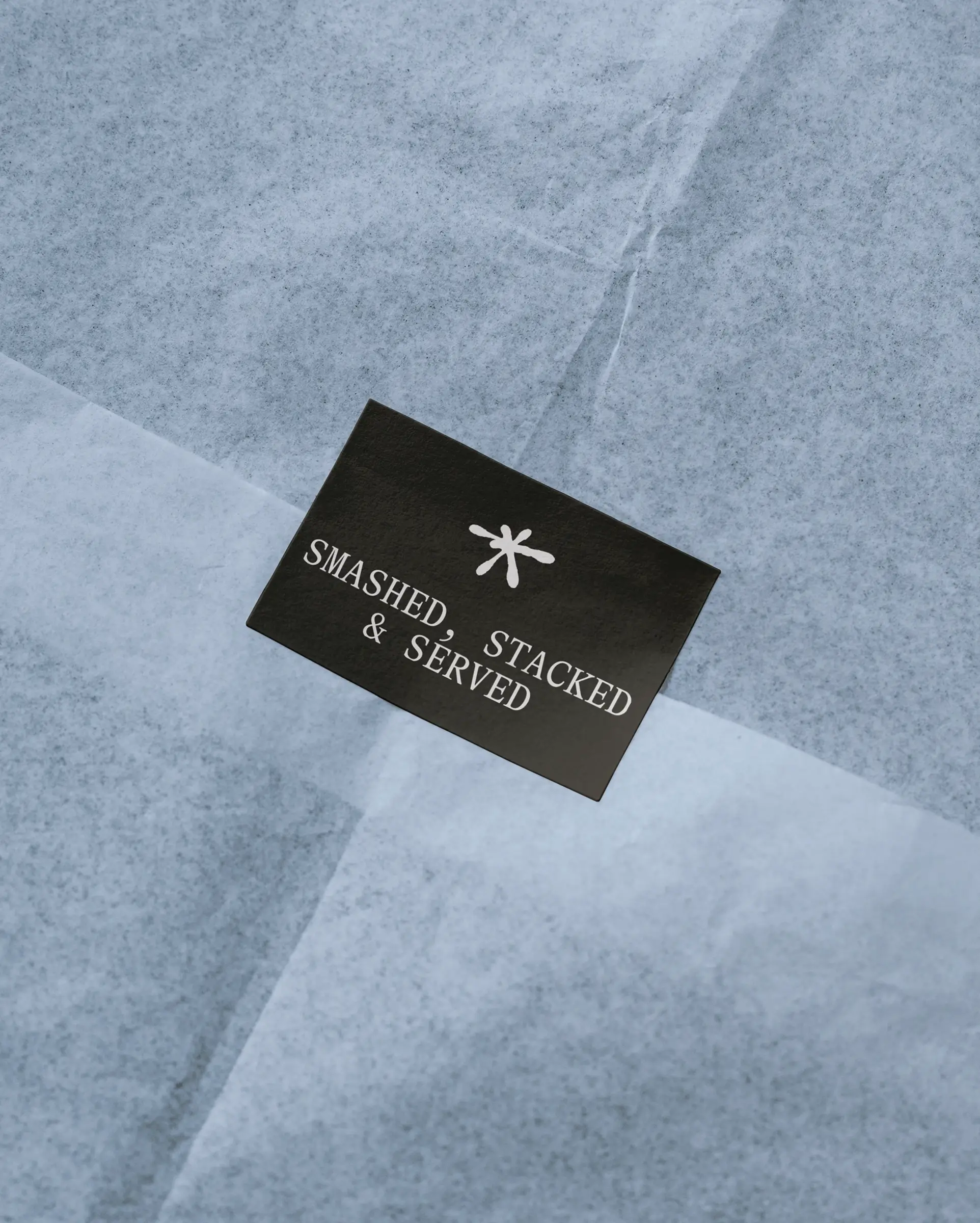
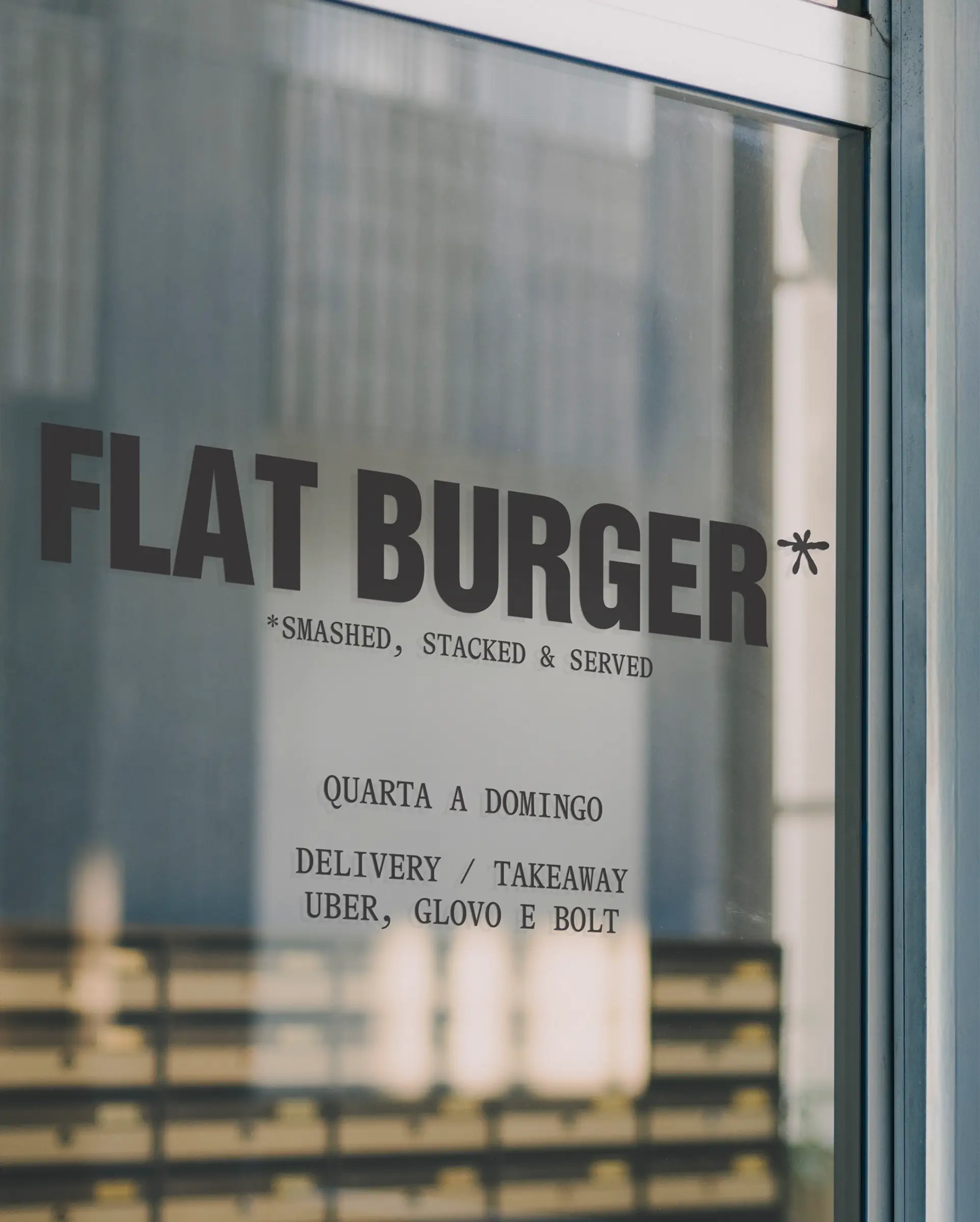
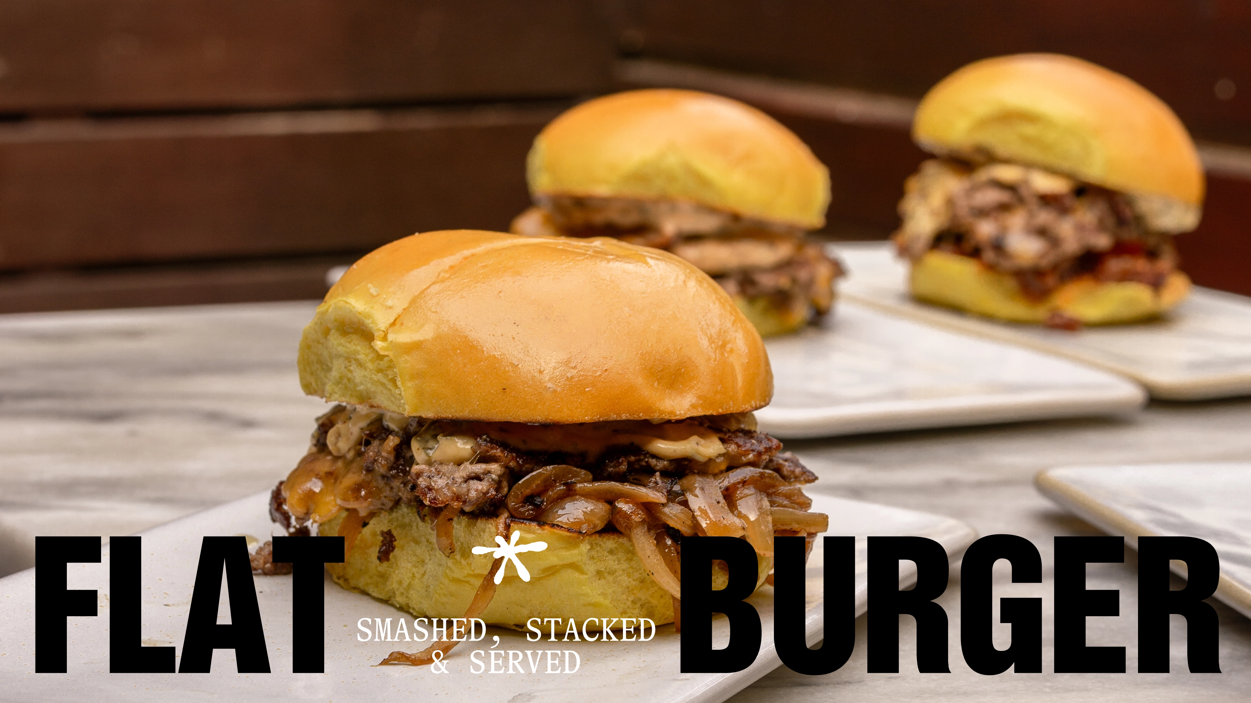
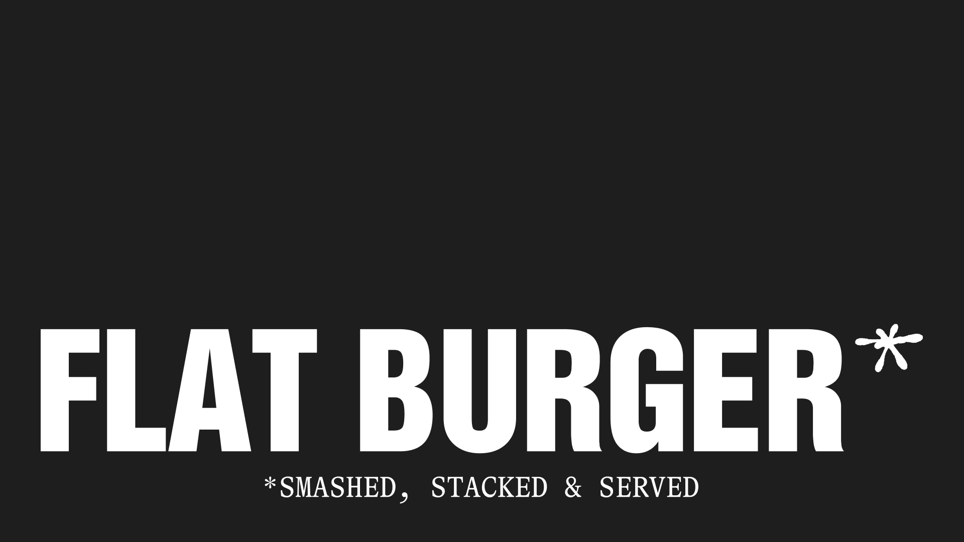
Smashed, stacked & served
FLAT Burger is a no-nonsense restaurant in Porto serving smashed burgers; food that’s fast, messy, and unapologetically good. From the start, the challenge was to create a brand that didn’t just blend into the city’s burger scene, but one that hit with the same impact as the food itself.
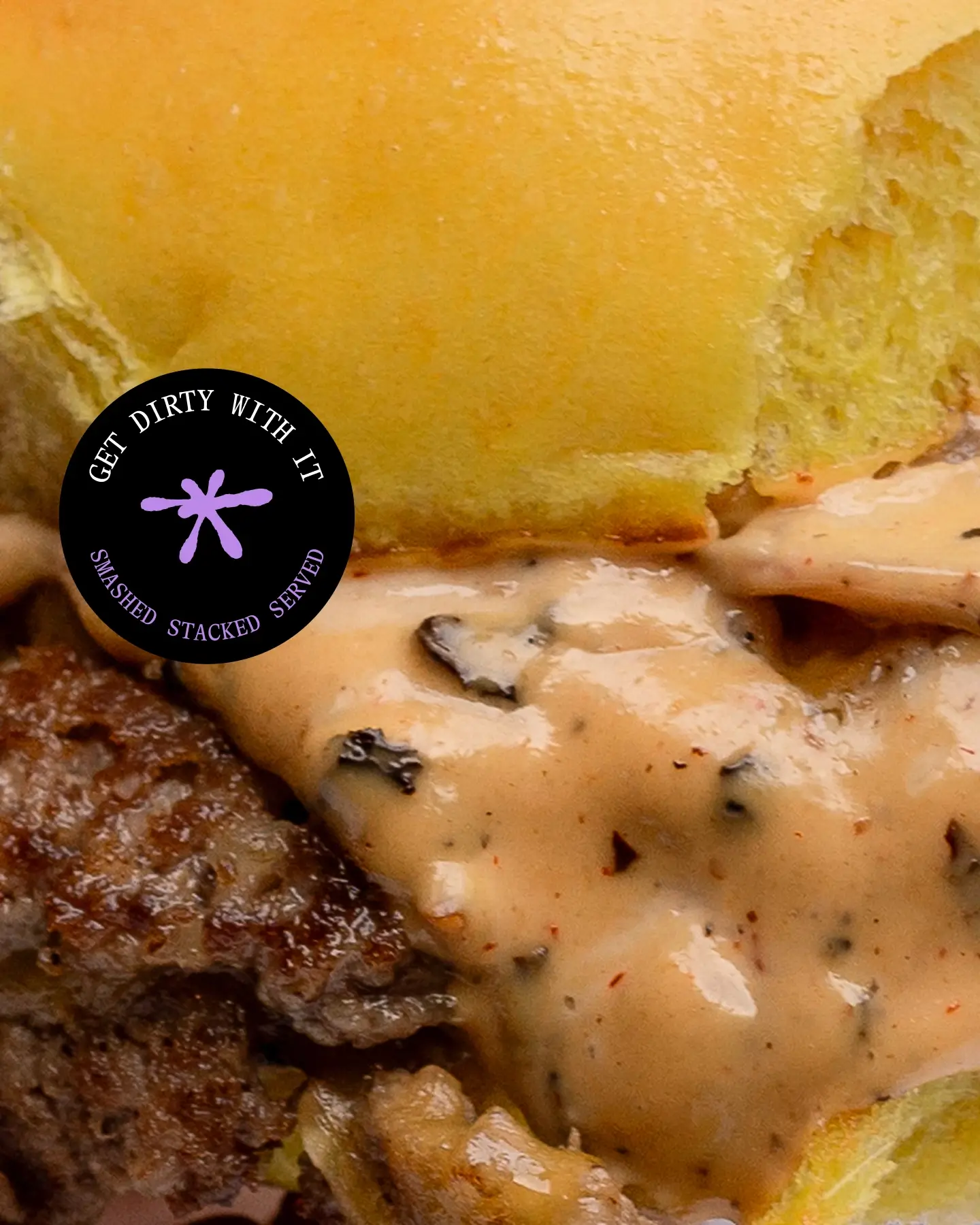
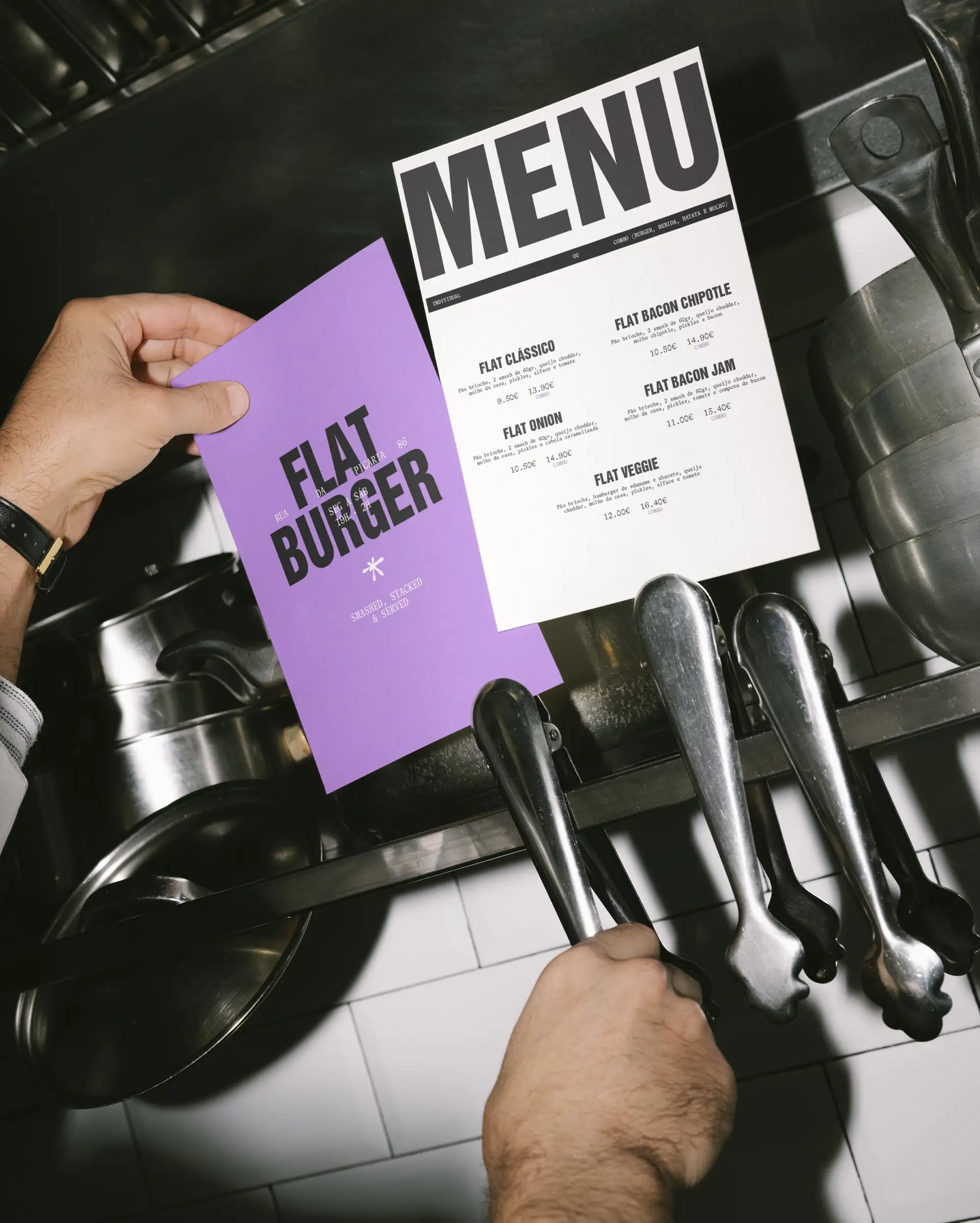
We leaned into this attitude with a visual identity that’s crude, raw, and proudly imperfect. The palette is led by a vibrant, high-voltage purple — a bold move in a market dominated by blacks, reds, and neutrals. It’s a signal that FLAT Burger doesn’t follow the rules; it makes its own.
Irreverency & Clarity
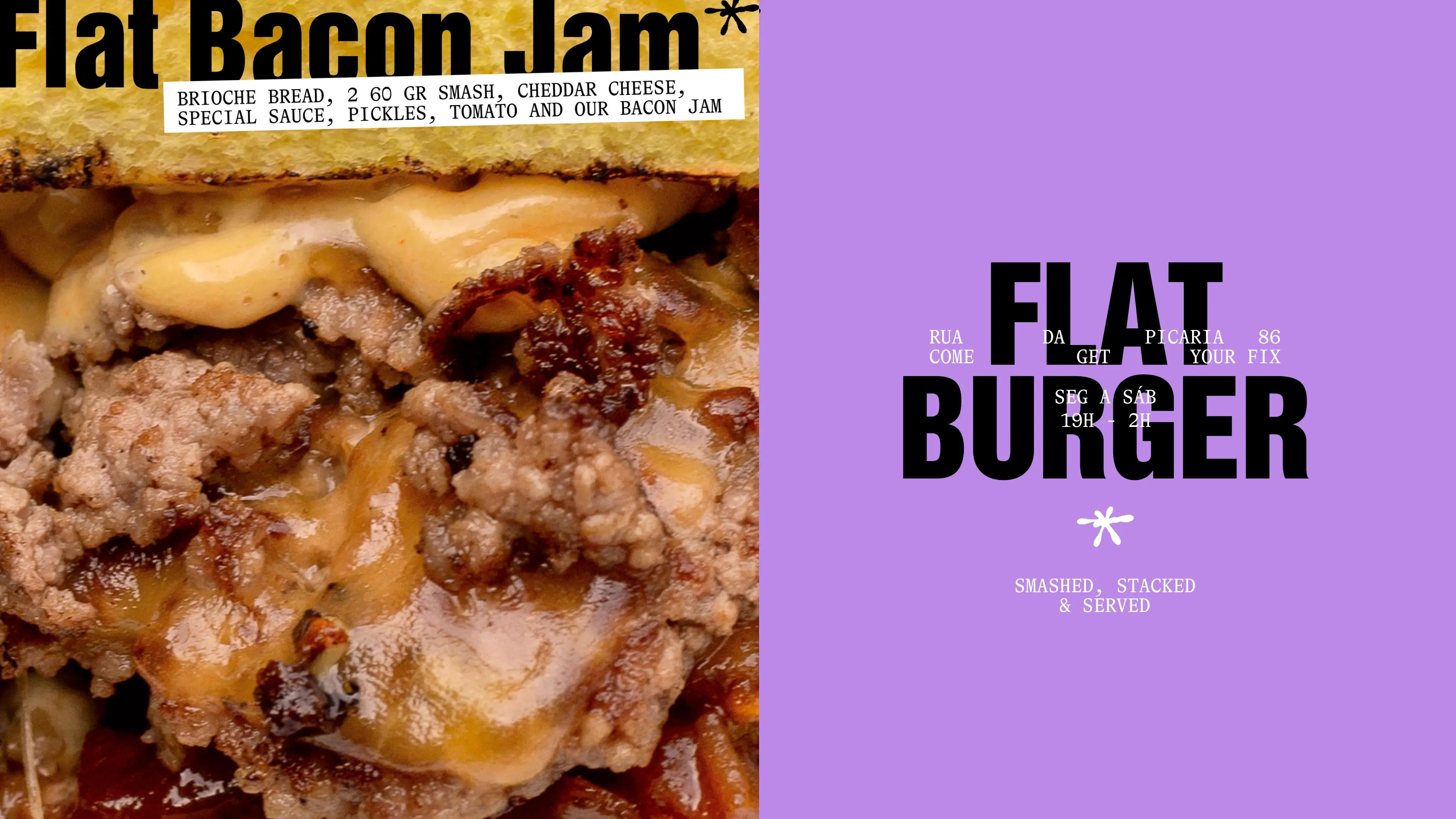
Typography does the heavy lifting: a condensed, industrial typeface brings punch and immediacy, while a contemporary serif cuts through with edge and balance. The tension between the two creates a voice that feels both impactful and unexpected: loud without being one-note.
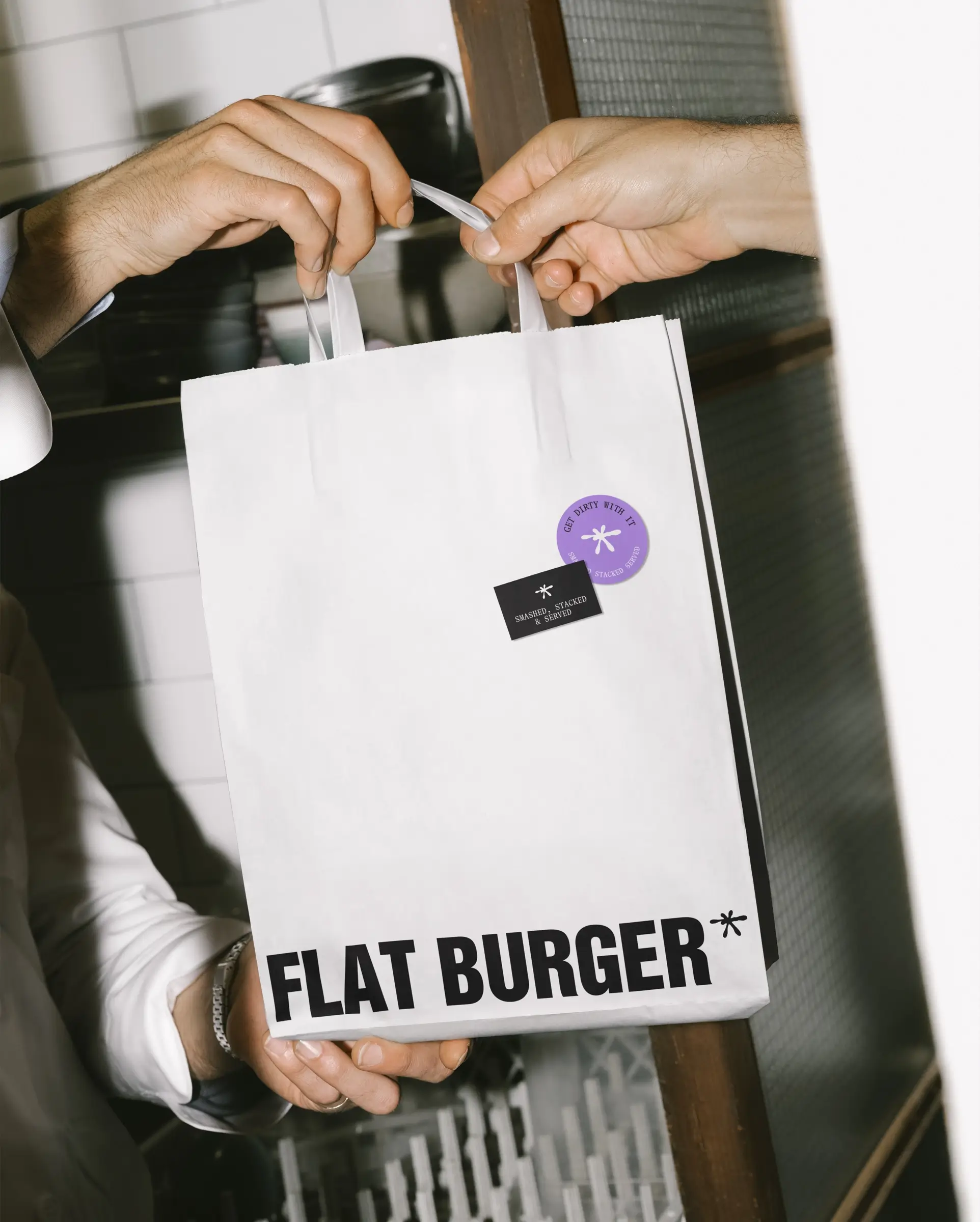
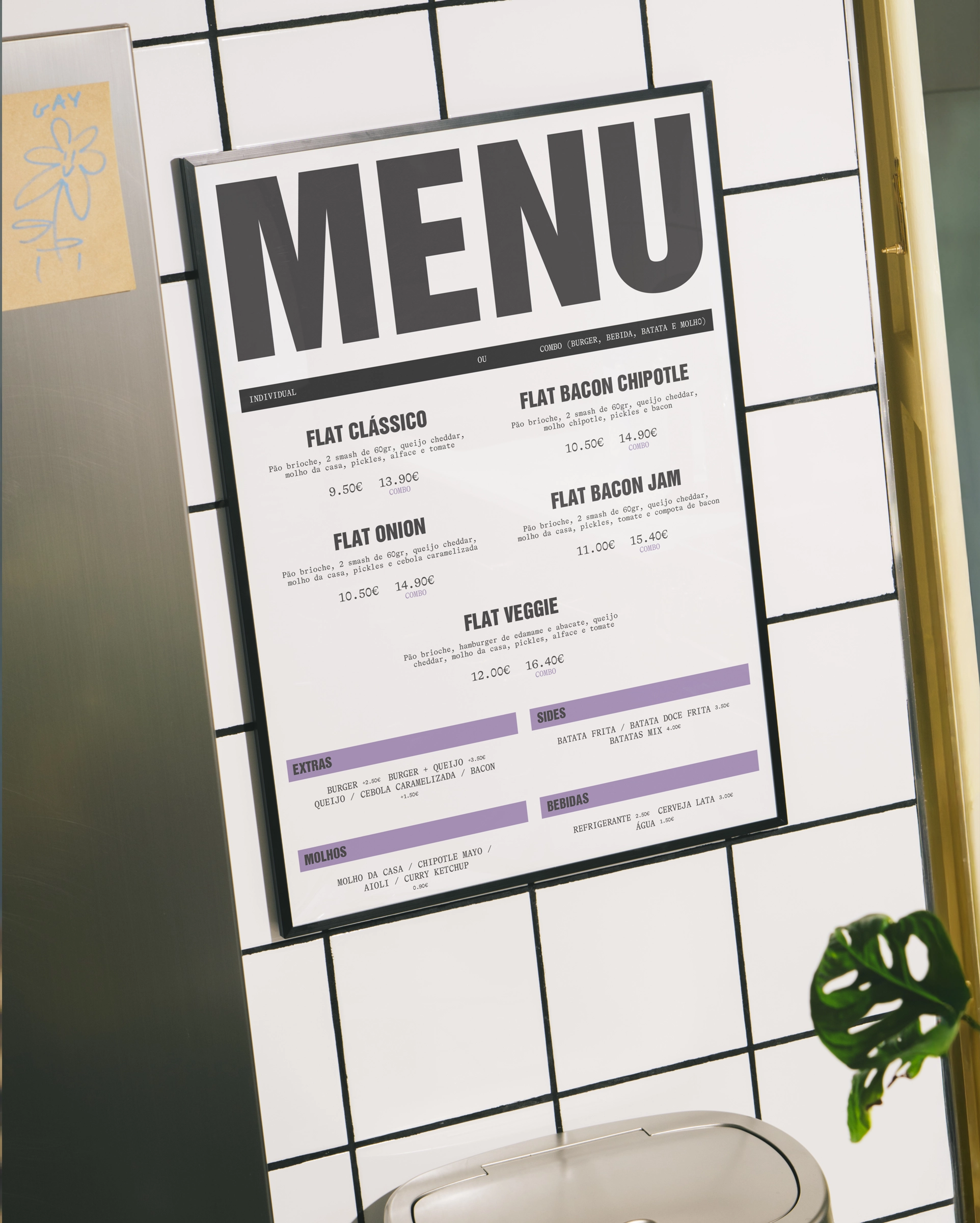
The identity strips away excess decoration to keep the focus where it belongs: the food. Every design choice, from the blunt typography to the vivid purple, acts as a frame, never a distraction. It’s branding that doesn’t try to outshine the burger, but makes sure the restaurant can’t be ignored.
Through this mix of irreverence and clarity, FLAT Burger establishes a distinct position: a raw, energetic brand that serves its message as straight as its food: flat, smashed, and unforgettable.