Turning design into a competitive advantage
The Ideation Collective studio focus is to create partnerships and diverse teams that work side by side with their clients to solve the most complex problems. Keeping this collective idea in mind, we built a dynamic branding that could embrace and involve all the partnerships and services that the studio provides.
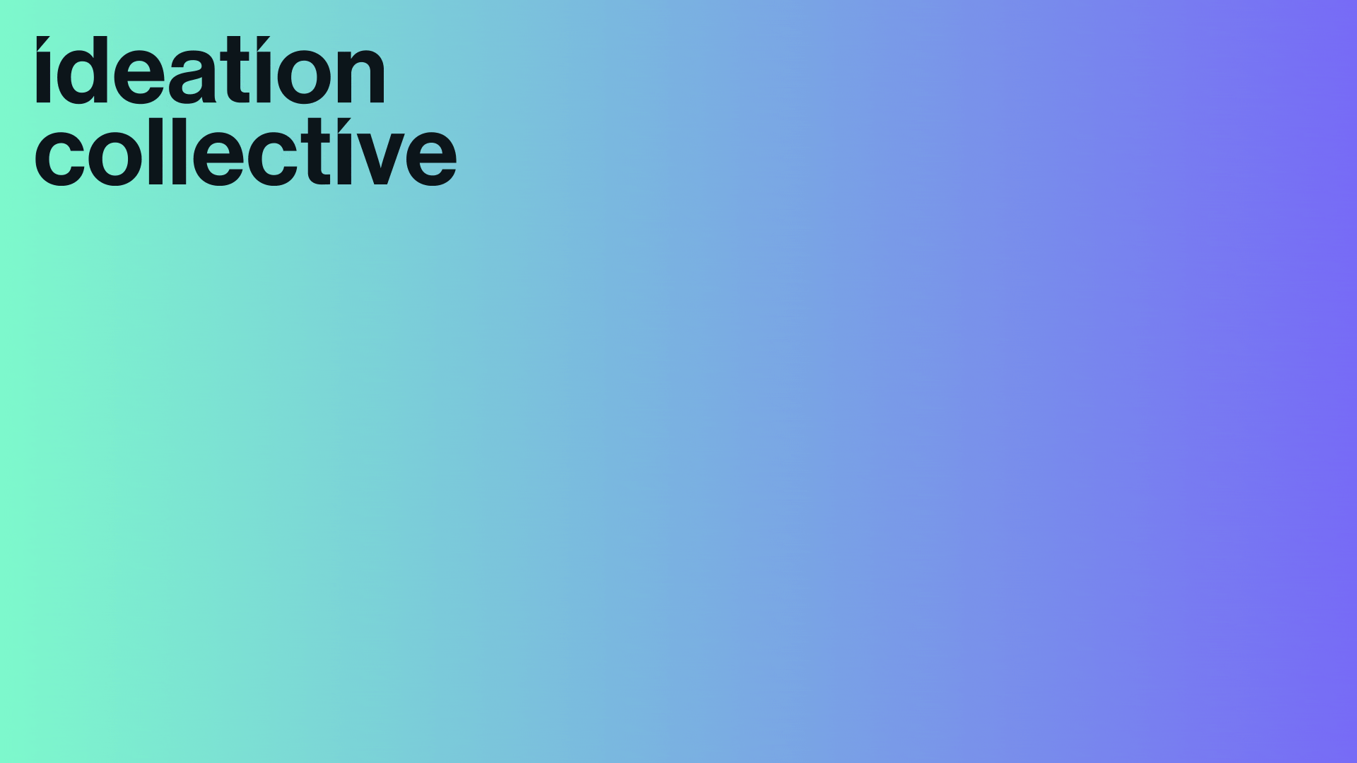
Dynamic Branding
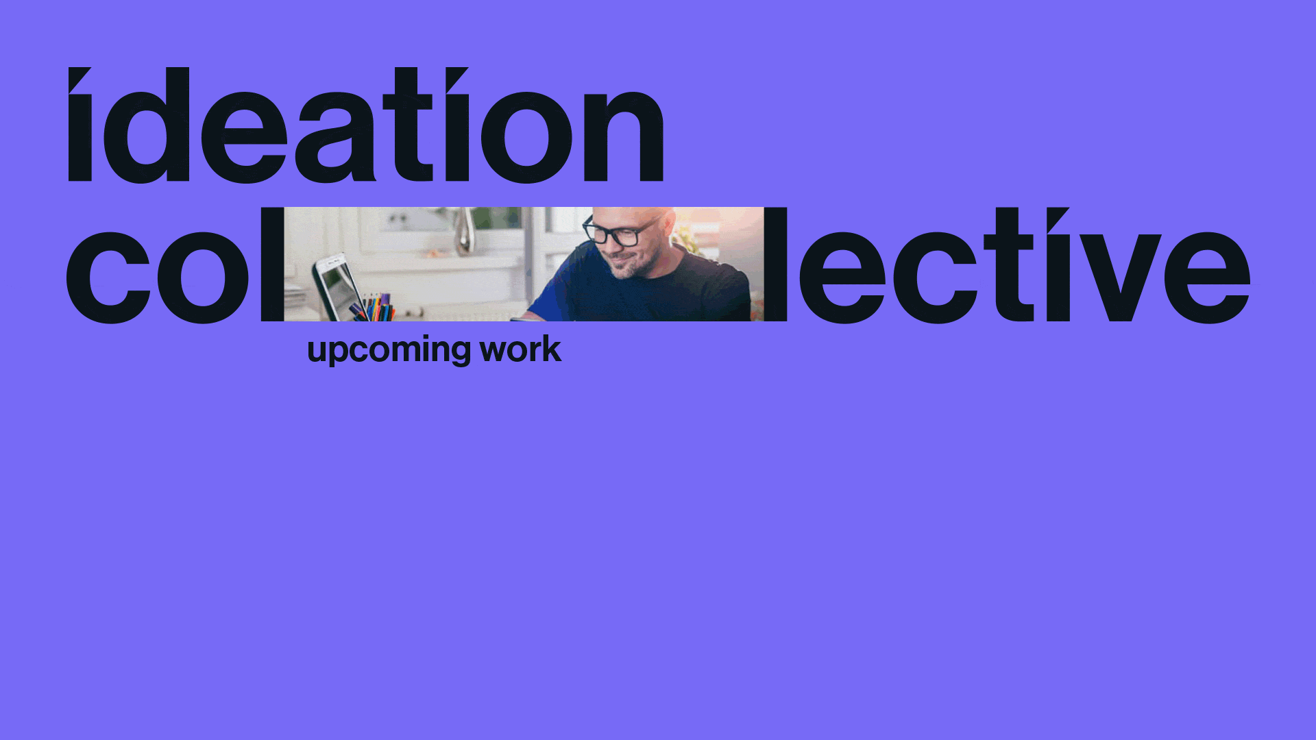
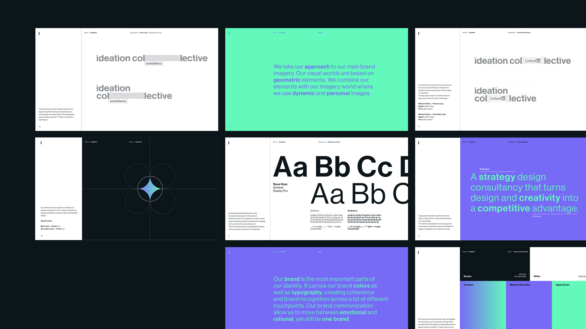
Graphically we used the two letters “l” from the word collective to add movement to the brand, by opening it and closing it in order to embrace what the brand wants to communicate. This motion movements were created to work either with words, images and/or logos. Since the brand is mostly working in the digital field, the choice of colors took inspiration from that. Two main colors are used — green, linked to the idea of collective, and lilac, the color of innovation and technology. The two colors are also used together in a gradient that directly connects to the fluidity of the brand as a collective partner. In order to fully communicate the brand, we also created several icons that follow the same clean and minimalist graphic approach. The elements and the icon system are refined to its simple and geometric form, using contemporary design principles to create a unique and timeless design.